7 Push Notification Campaigns Optimized with AI and Multivariate Testing
| Bonus: |
How often do you get a notification that you actually open? And how many of these lead to a conversion? Creating a good push notification campaign is a science—you need to send out content that people enjoy reading, so much that they don’t swipe it away into nothingness. The only way to objectively figure out what works is by experimentation, but marketers often don’t have the time to run manual A/B testing campaigns, interpret results, and then optimize.
Multivariate testing and AI-based optimization address these problems. Here’s what these terms mean:
- Multivariate testing: It’s like A/B testing—but better, because you can experiment with up to 5 variants of the same message to see which works best.
- AI optimization: An AI engine like MoEngage’s Merlin AI automatically analyzes the performance of each variant, figures out the best one, and dynamically adjusts the campaign to send this variant to users.
In this blog, we take a look at 7 companies that have improved their push notification CTRs by up to 255% with MoEngage, using multivariate testing and AI-based optimization. We break their campaigns down to understand what works and what doesn’t.
Example #1: A FinTech company in India
This app sent out a push notification campaign to drive more users towards taking credit. Any users who had already taken credit in the past 60 days were excluded from the campaign. The conversion goal was to click on an actionable web link.
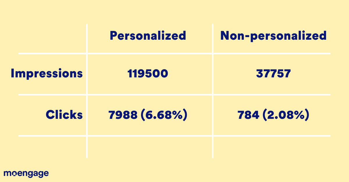
This company also experimented with the personalization aspect—some users were sent a personalized notification, and the rest were not. Here are the results of the personalization test:
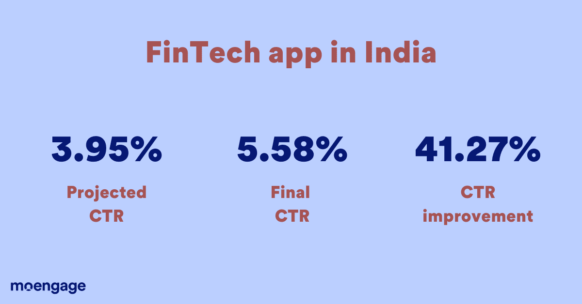
The company sent out four variations of the same message, with a projected CTR of 3.95% and deployed MoEngage’s Merlin AI to perform dynamic multivariate testing. This resulted in a CTR of 5.58%, which is a 41.27% improvement.
Let’s take a look at the actual notifications:
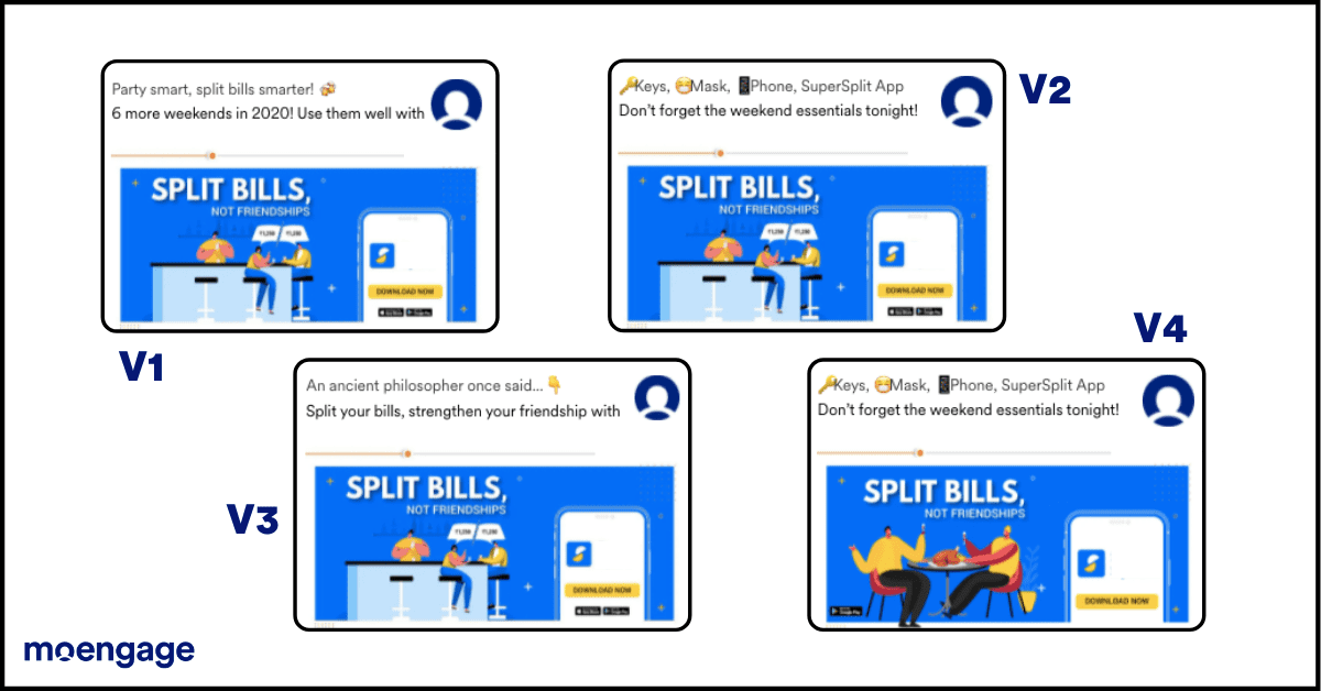
The winning combination (V3) is a bright image that appeals to people’s emotions (‘Split bills, not friendships’) and makes people feel better about themselves (‘Party smart, split bills smarter’). It also captures the most significant problem people face when they’re out in a group—splitting bills easily—and offers a handy solution.
Takeaway: Appeal to emotions and address a user’s specific needs or problems.
Example #2: A prediction app in the US
This weather prediction app sent out a notification with the goal of increasing engagement. Users who hadn’t opened the app in a long time were targeted, and the conversion goal tracked was ‘app open.’
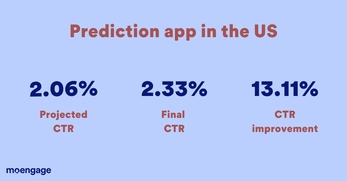
This app sent out two variations of the same message with a projected CTR of 2.06%. The final CTR they received was 2.33% using MoEngage’s Merlin AI, a 13.11% improvement over the prediction.
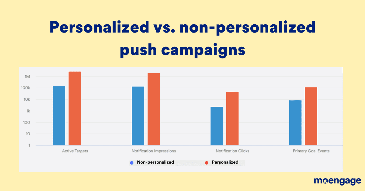
They also experimented with personalization: some users were sent personalized messages and the others were not. Here’s how that panned out:
Here’s a comparison of the two notification variants:
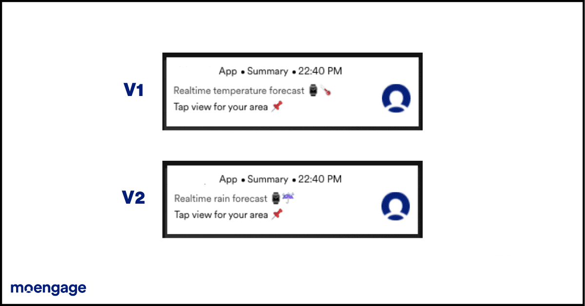
You’ll notice that only one word is different between the two variants—but even this slight difference is enough to create a 13.11% improvement in CTR from the projected value. The word ‘rain’ in the winning variant, V2, makes more people click on the notification than the word ‘temperature’ because ‘rain’ is closer to people’s needs than ‘temperature,’ which is a broader term.
Takeaway: Understand what your users resonate with and communicate in their lingo.
Example #3: A Healthcare app in the SEA region
This app sent out a campaign to users who hadn’t booked a PCR test (to detect COVID) in the last three months. The conversion goal was to book a test through the app, which is slightly ambitious because there is no data available to the company about whether anyone in the target audience is currently ill. Even so, the app saw about 336 unique conversions from 60,000 people who received the campaign.
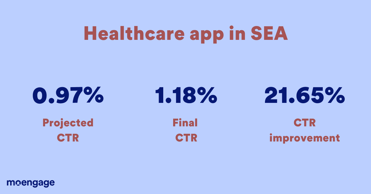
The projected CTR was 0.97%, but the final CTR turned out to be 1.18%, which is a 21.65% improvement achieved using optimized push notification campaigns.
We’ve pitted the two variants against each other:
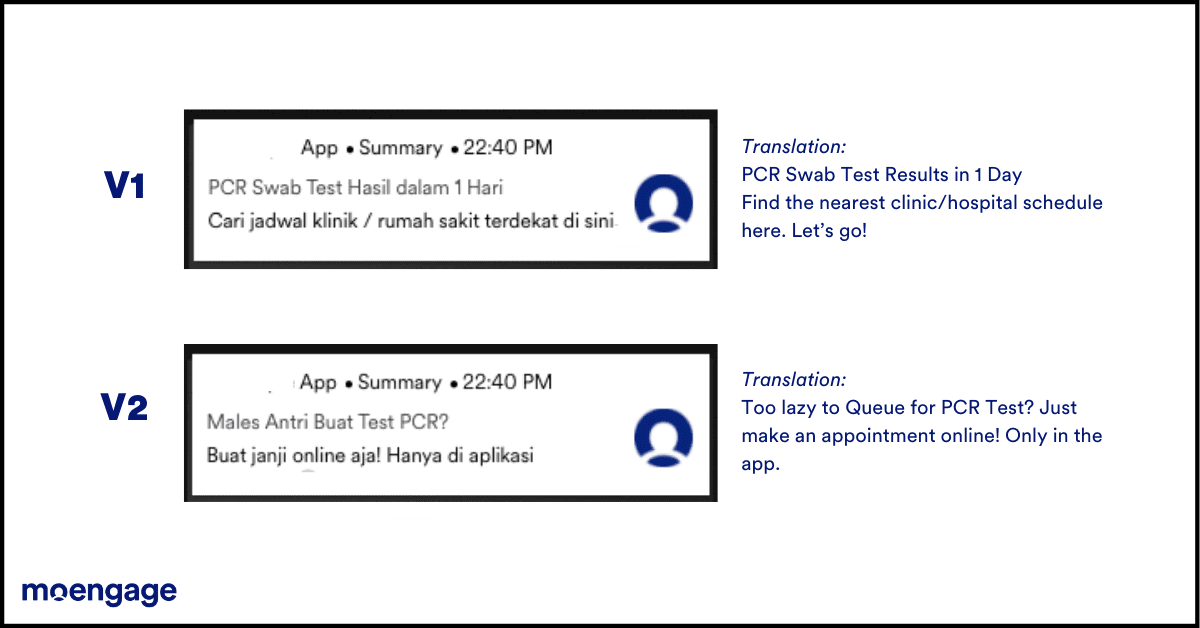
Notice how localization has been prioritized—vernacular languages speak to the audience rather than English.
The winning variant (V1) also chooses to pitch a sense of urgency, talking about the speed of test results, the proximity of a lab, and an actionable ‘let’s go!’
Takeaway: Localize your messages and pitch a sense of urgency.
Example #4: An eCommerce app in India
This app sent out a hyper-localized campaign targeting people who hadn’t ordered bread in the past 15 days. The campaign talks about a special type of bread (multi-grain) that can be delivered within 36 hours of baking, so some users in regions far away have been excluded.
Learn how to set up such highly segmented campaigns with MoEngage.
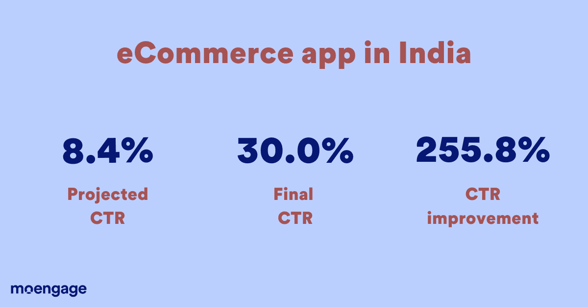
The projected CTR for this campaign was 8.43%, but the company saw an actual CTR of 30%, a 255.87% increase from the predicted value. This was achieved using Merlin AI’s dynamic multivariate optimization algorithm, where the best performing variant (out of 5 options) was automatically deduced and shown to a majority of the target audience.
Let’s take a look at the five variants:
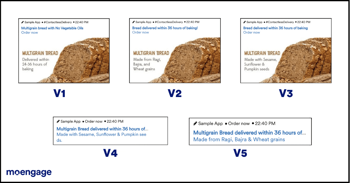
Surprisingly, the most successful variant (V5) isn’t the one with a picture, but one without! This one talks about the most significant differentiator upfront: ‘multigrain bread delivered within 36 hours’. It is clean and to the point, telling people what the bread is made of in English (Sesame, sunflower, pumpkin seeds) rather than the vernacular language (Ragi, Bajra, & Wheat grains). This shows that over-localization can backfire—while it is good to speak to customers in their vernacular language, you must also make sure to use commonly known phrases.
Takeaway: Create concise messages that mention the most significant differentiator upfront.
Example #5: An IT app in the MEA region
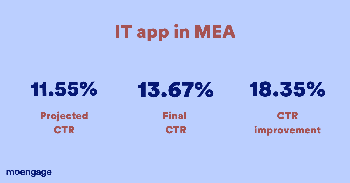
This app sent out a referral campaign targeting all its users, encouraging them to refer their friends in exchange for coupons. The projected CTR for this campaign was 11.55%, but the company saw a 13.67% CTR using MoEngage’s Merlin AI. This is an 18.35% increase from the prediction.
The app sent out two variants of the same notification, and here’s a closer look at each one:
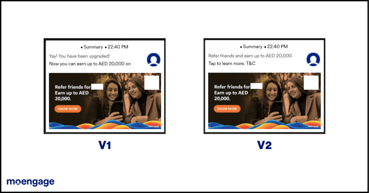
So what worked? The first variant is more enthusiastic, giving people the feeling that they’ve benefited from something. The use of the words ‘Yay!’ and ‘You have been upgraded!’ give out a very positive, feel-good vibe, which is what may have worked in their favor. On the other hand, the second one repeats the same message in the text and the image—and this does not work well.
Takeaway: Send out enthusiastic campaigns that display a feel-good factor.
Example #6: A travel and hospitality app in the EU
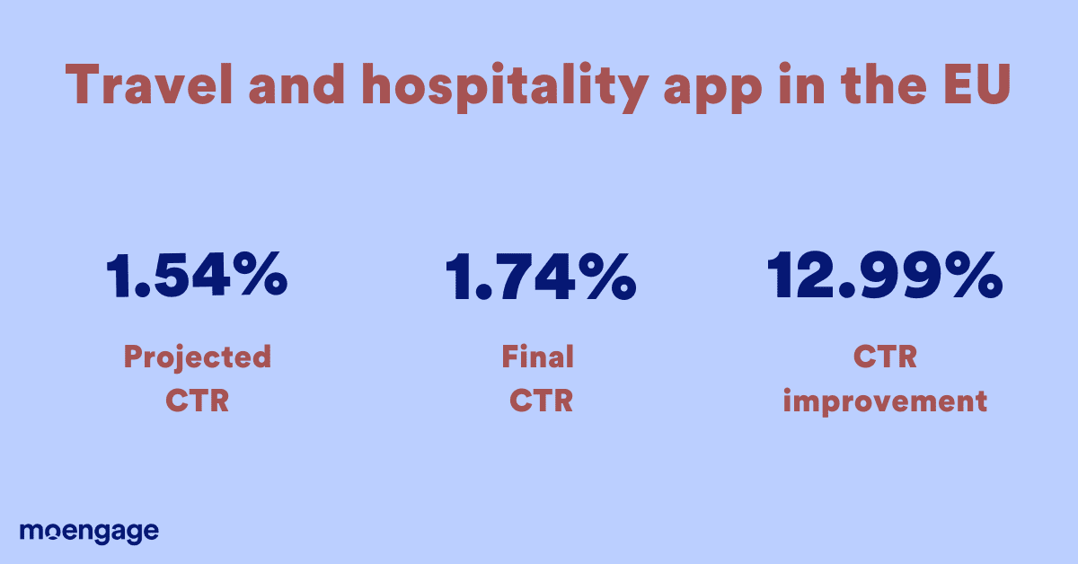
This company sent out a push notification campaign to users who had opened the app in the past month but not booked a rental home through the app. The primary goal was conversion—campaign success was listed as ‘property visit scheduled.’
The company also created a ‘control group’ to measure how many people converted if they didn’t receive any campaign. The projected CTR was 1.54%, and the final campaign saw a CTR of 1.74%, which is a 12.99% improvement.
Let’s take a closer look at the notification variants:
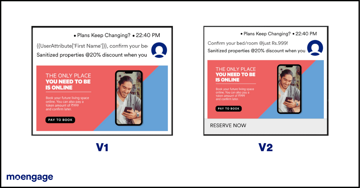
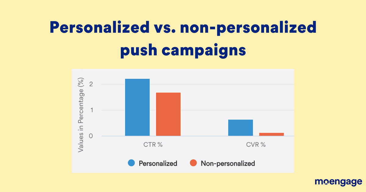
The winning variant (V1) is almost the same as the other variant, except for two things. One is that the winning variant is personalized to address the user by first name. This is how the personalized notifications performed in comparison with the non-personalized ones:
Next, if you look closely, you’ll notice that the second variant has two CTAs. This could be another reason it didn’t perform well—too many CTAs distract the user from their primary objective. The winning variant has only one CTA, is neat, and tells the user precisely what to do without confusing them.
Takeaway: Personalize your messages and don’t include too many CTAs.
Example #7: A gaming app in India
This app, chasing conversion goals, sent out a push campaign to all its users, incentivizing them to add money into their app wallets. No users were excluded, and the campaign was sent out on a Friday evening—the perfect time to capture an entertainment-hungry audience.
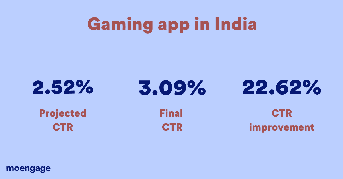
While the projected CTR was 2.52%, the company saw an actual CTR of 3.09% using Merlin’s AI-based optimization. This is a 22.62% improvement over the prediction.
The app sent out two variants of the same campaign:
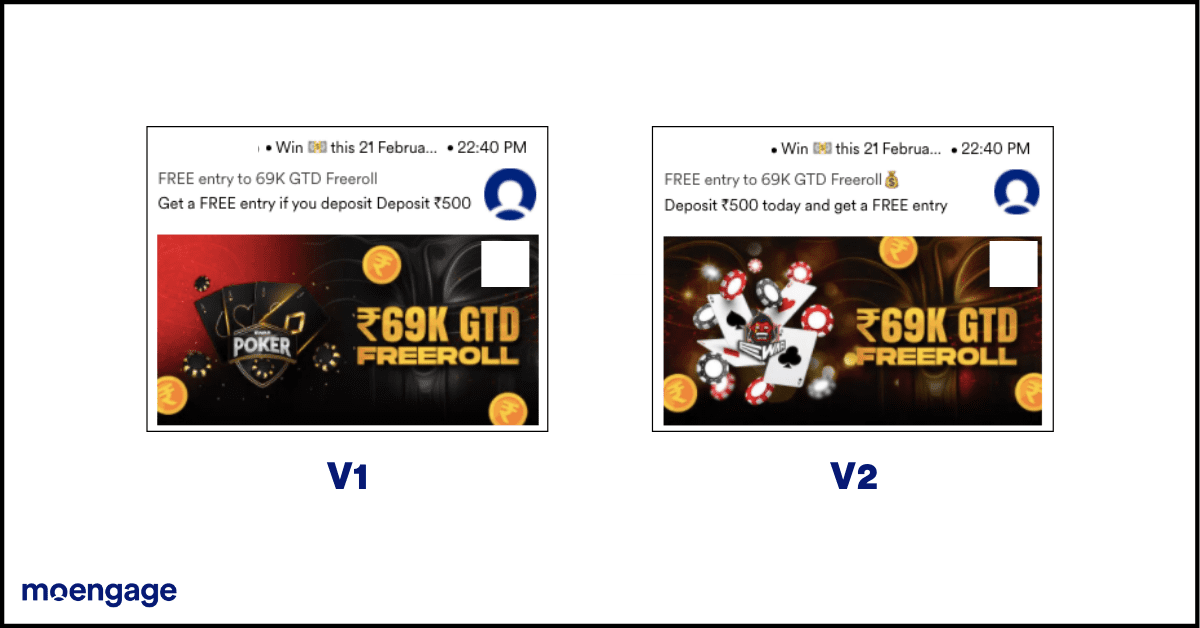
The winning variant has a cleaner image, using lesser colors to position the ‘69K GTD freeroll’ benefit more clearly than the other one. The second variant is too noisy (visually) for the reader to digest a benefit.
In addition, the text in the winning variant tells users that they’ll ‘Get a free entry if they deposit INR 500’. It shows the benefit first and the process next, as opposed to the second variant saying ‘Deposit INR 500 and get a free entry,’ which displays the process first and the benefit later.
Takeaway: Create clean images and content that display the benefit prominently.
Tips for creating successful push notification campaigns
Here’s a quick summary of the biggest takeaways from each campaign:
- Appeal to people’s emotions.
- Understand what problems your users face.
- Get specific about the benefits offered.
- Localize your messages where possible.
- Create a sense of urgency, prompting them to act.
- Mention the most significant differentiator upfront.
- Send out crisp and clear messages.
- Make your campaigns sound enthusiastic.
- Display a feel-good factor.
- Personalize your messages.
- Don’t include too many CTAs.
How these 7 companies optimized their push campaigns
Traditionally, marketers create manual clusters of users and send out different message variations to each set. Once the campaign is completed, they analyze the performance in each group to figure out the best message variation. This drains time and resources and is slow to implement. The learnings from one campaign can only be applied to the next one.
This is where AI optimization by engines like MoEngage’s Merlin AI help. Merlin AI automatically analyzes the performance of each variant, deduces the best one, and alters the ongoing campaign to send out the best-performing variant to the maximum number of people. It optimizes your push notification campaign to get statistically better results.
If you’d like to see Merlin AI in action, hit the button below:
GET A DEMO NOW

