7 Retailers Who Have Mastered the Best Mobile User Experience

Reading Time: 6 minutes
A few years ago, we’d joke, “I wish there was an app for that,” but the joke has become reality. Now there really is an app for that—whatever that might be.
On my own phone, I have apps that help me tune my guitar, avoid traffic jams, find audiobooks, track my steps, manage my finances, unlock the front door of the local co-working space, buy train tickets, take online classes, and turn photos into artwork… to name only a few.
People want access to everything in the palm of their hands, and that’s why apps have proliferated, with retailers taking notes and developing their own mobile apps. But just because you build it does not mean they will come, because people are also picky. They won’t download and use an app just because you made one.
But make an app that delivers on what consumers want, and they’ll keep coming back to it for more. And we found seven retailers that did exactly that.
Defining a Good Mobile User Experience
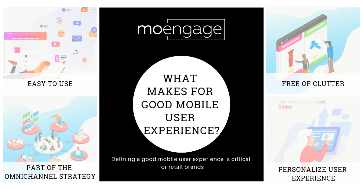
Before we look at the retailers that have mastered the mobile user experience, let’s first clarify what that means. What makes for a good mobile user experience? In general, your app should:

- Be easy to use: Know what it is your users want to accomplish with your app and then make it as easy as possible for them to do so.
- Be free of clutter: Minimize elements like navigation, keep any steps to a minimum, and make forms easy to fill out and use on a small mobile touchscreen.
- Be part of your omnichannel marketing, providing a seamless experience between your app, website, brick-and-mortar store and social media
- Personalize, personalize, personalize the experience
| Bonus Content
👉 The Complete Growth Strategy [Download Handbook] 👉 Beginner’s Guide to Omnichannel Marketing for 2021 [Download Ebook] 👉 Retail Strategies and Omnichannel Engagement Frameworks [Download Ebook] |
Mobile Users Need a Reason to Download a Mobile App
Once you know you can develop your app with the user in mind, what’s next? Making your app delivers what the customers want most. Why do users choose to use an app? Often they are drawn to apps that save them time and effort, but they are also drawn to apps that enhance their experiences, offer more information, or in some other way fills a void. Don’t assume that quick and easy is the only benefit your app can offer. Sure, it should be part of your user’s mobile experience, but maybe not the primary feature.
7 Retailers Giving Consumers What They Want
We found seven retailers with distinct niches in the app space because they focused on the primary benefit they could provide to their particular users. Although quite a few retailers have mastered the mobile user experience, we’ve listed only seven below to point out the different approaches retailers can take based on what’s appropriate for their target audiences. Start with the user and build your app experience based on that. That’s what these brands did.
When users want to visualize products in their space…
Although we’ve come to love online shopping, the experience is limited compared to viewing products in real life in a brick-and-mortar location. Overstock and IKEA are two brands that have put that in-person experience into their customers’ hands with apps that help the users virtually see and experience the products they sell.
#1 As a 7-time award winner for Best Retail Mobile Application, Overstock is obviously doing something right when it comes to the mobile user experience! The Overstock app offers augmented reality (AR) so customers can visualize how furniture will look in their home plus the app makes it easy to pay with Google Pay.
#2 IKEA also knows users shopping for furniture will want to know how it will look in their home, and they launched their AR app called IKEA Place in 2017 to meet that need. The app automatically scales furniture based on a room’s dimensions and it’s so detailed users can see the textures and how light and shadows will look. The app digitally places IKEA products in a room, plus it enables users to capture the setting in the app and share it as an image or video. (And maybe if customers use the app instead of the brick-and-mortar stores, fewer customers will get lost in those massive mazes that are also part of the IKEA experience…)
When customers want fast and convenient…
Some brands can win consumer hearts with speed and convenience, especially when it comes to food and drink but also when it comes to a repeat purchase like prescriptions. Starbucks, Chipotle, and Walgreens offer mobile user experiences that meet that consumer demand for right now.
#3 Starbucks knows people want their drinks fast and to pay for them quickly, and that’s what the Starbucks app delivers. Customers can order and pay for their drinks and food with the app, plus tip their barista and identify the songs they’re hearing in the Starbucks store so they can add them to a Spotify playlist.
 #4 Walgreens knows customers don’t want to wait around for prescription refills any more than they want to wait around for a coffee or a burrito. Their mobile app makes it super easy to request a refill by simply scanning the barcode of the product that needs refilling—and it reminds customers when a refill is needed if the request hasn’t been made. Users get notifications when prescriptions are ready for pickup. And they can use the Pill Reminder feature like an alarm letting them know when it’s time for the next dose.
Building on the in-store experience…
Some apps offer the biggest benefit by supplementing an in-store experience and well they should because 80% of customers use their mobile phones while shopping in a physical store. The Home Depot and Sephora are two brands that have mastered this approach.
#5 The Home Depot typically has huge stores full of bulky products but not huge numbers of employees available to help customers. That makes the in-store part of the mobile app extra helpful. A customer can use the app to locate a product within the store so they can walk right to it. The Home Depot also enhances the in-store experience with their mobile app by offering QR and bar codes customers can use to learn more about a product while shopping, and even read reviews.
#6 Sephora is not only one of the most popular beauty brands today, but a brand that has mastered the mobile user experience, using the app to enhance the in-store experience in addition to making online shopping incredibly easy for their customers. When not in the store, users can use the Virtual Artist makeover tool for a new look as well as shop and earn rewards plus get advice and new ideas. In-store, users can scan bar codes to read product reviews and watch how-to videos, as well as check their buying history.
#7 Oasis, a fashion retailer in the U.K. combined their e-commerce site, mobile app, and brick and mortar shop to offer a seamless shopping experience. When a customer walks into the retail store, the sales associates offer on-the-spot product information using their iPad. If the product is out of stock, they order it online and ship it to the customer directly.

When You’re Ready to Master the Mobile User Experience…
When you’re ready to take your retail or e-commerce app to the next level, look to MoEngage. We’ll help you deliver personalized in-app experiences in minutes with NATIV. With NATIV, you can upgrade your onboarding experience, engage users to keep them coming back, create targeted messages, get detailed analytics on campaign performance, and much more.


