7 Powerful In-App Messages Strategies [With Examples]
![7 Powerful In-App Messages Strategies [With Examples]](https://www.moengage.com/wp-content/uploads/2016/06/Screen-Shot-2016-06-14-at-6.05.40-PM.png)
Reading Time: 6 minutes
|
You’re finishing up your last-minute sale shopping on your app and are suddenly met with this ugly-looking pop-up, almost like an ad, suggesting you drop what you’re doing to do something else! Annoying isn’t it? If you agree and do not wish to knowingly or unknowingly put your app users (anymore) through this agonizing experience, read on.
What is wrong with your in-apps?
Generally speaking, in-app messages are good. In fact very good for your business as in-app messages resonate with up to 28% of your campaign audience. The difficult part, however, is figuring out which of your users and when they should see an in-app thus increasing the likelihood of users interacting with it. Listed below are a few strategies for building great-looking in-app messages that drive engagement. Read further to find out if you are doing some or all of them wrong.
| Bonus Content 👉 Vedantu Grew 65% of Their Topline Business With Insight-led Engagement [Case Study] |
How to create in-apps that delight users?
1. Picking the right channel
Let’s get this out of the way first. What is the purpose of creating an in-app? Quite often we are not sure whether we are using the right channel to communicate with our users.
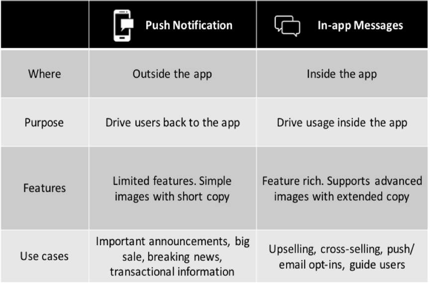
For example, find below a chart showing the differences between push and in-app messages.
2. Be Contextual
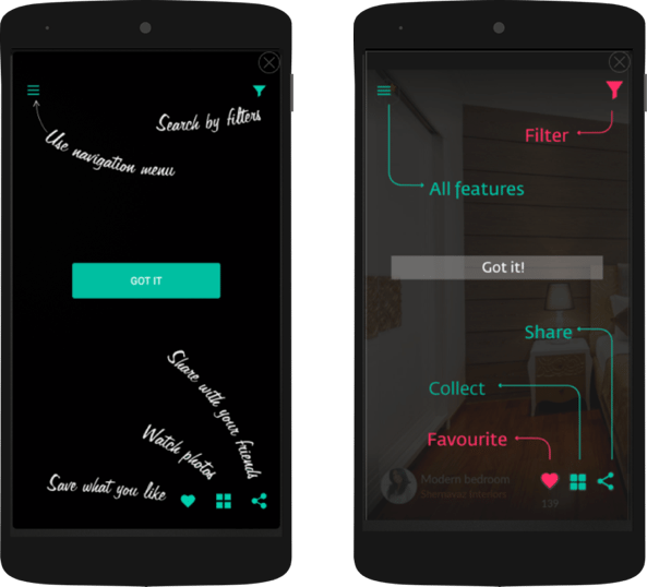
“Context is king” should be the next big marketing headline. Whatever the goal you are trying to achieve through in-apps, being contextual help add value during app usage. Keep track of user actions and behavior to trigger appropriate messages that show at the right time. Take a look at a few examples below:
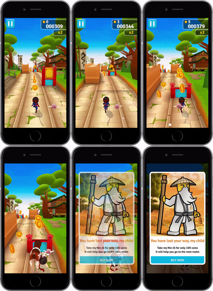
3. Drive app usage
Create great app experiences through in-the-moment recommendations to drive more app usage and reduce app abandonment. Make users keep coming back for more.
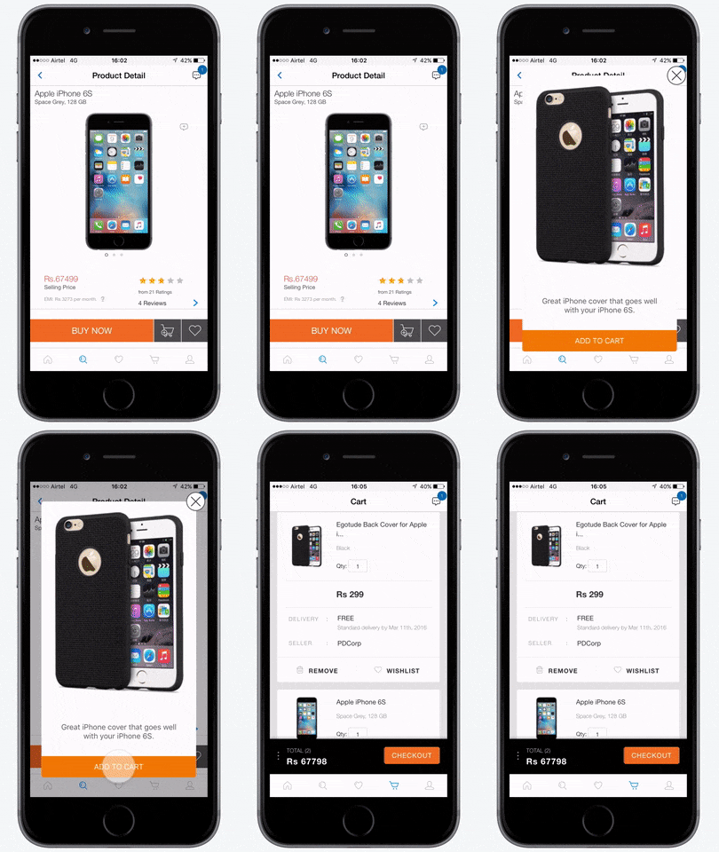
4. Drive purchases
Give users a great reason to buy more. Send relevant recommendations in real-time at opportune moments to drive purchase. Here, a user is shown a relevant in-app for iPhone cases soon after purchasing an iPhone.
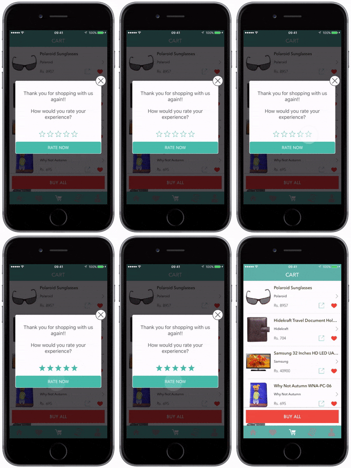
5. Boost your app ratings
Prompt customers who love your app to rate it on App Store/ Google Play through in-apps. It is always beneficial to show rating in-apps soon after a user completes a purchase and not during the process.
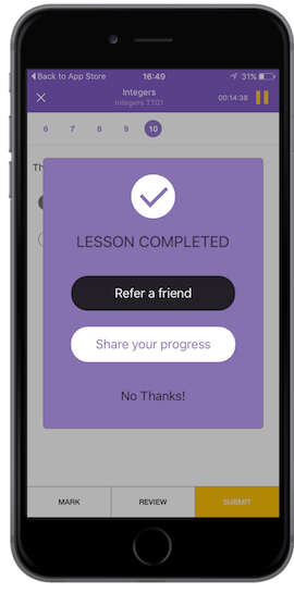
6. Acquire quality users through referrals
Drive user referrals by sending contextual messages. Creating such in-apps when a user accomplishes something on the app will act as a stimulus for them to share their achievements with their friends and hence more referral user growth for your app.
7. Familiarize your users with your app
Welcome your app users by familiarizing them with the layout of the app. Such in-apps work great when the user first opens your app. Remember, given the fact that a large number of users tend to drop off during the first few instances of your app it makes absolute sense to have in-apps that help users find their bearings with your app.
Segmentation
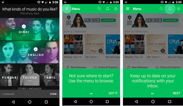
Your app users are unique. If you wish to get them to engage with your app in any manner, you need to take into consideration their behavior and attributes into account. By doing this, you can ensure that you are getting the right message across to the right people. Find below an example of an in-app specifically targeting new app users to set their music preferences for a streaming app. The in-app not only acts as a welcome message to users but straight away tells you about what your users want to see/ use on the app. It also goes on to familiarize users in a step-by-step manner about what they need to look out for in the app for the best experience.
Marketing is in its moments
It’s completely chaotic out there! A large part of your marketing success depends on how quickly you react to what people are experiencing out there. In a world where user loyalty depends on what they want at the moment than what brand, meeting user demands is a challenge. Unfortunately with the current set of tools out there, it is hard to do that. You are dependent on engineering and design resources while waiting for release cycles to deploy in-apps. What if you could deploy in-app campaigns as and when you sense your users need it?
Our intuitive in-app creator helps you achieve just that!
It helps you craft timely and beautiful looking in-apps which most of your users would love. No coding, no design. All within a few clicks! Watch the video below to learn more:
Get creative get beautiful
It doesn’t help if the messages are not good-looking enough to evoke a response from your users after all. In-app messages need to look native and a natural part of the app making them a part of the app experience. Ugly looking in-app messages that are reminiscent of the web pop-ups can be a huge turn-off for a lot of users. A large part of in-apps’ success depends on how they seamlessly blend in with the app design. Here are a few examples of the same:
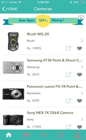
Here’s an example of a nudge in-app on an eCommerce app. See how the ‘Upto 50% sale’ in-app blends with the rest of the app? Almost like it is part of the app screen! That way the user is less interrupted in whatever he is doing.
Choose from a vast set of customizable pre-loaded templates and create campaigns on the go with your customer in mind.
Use Analytics
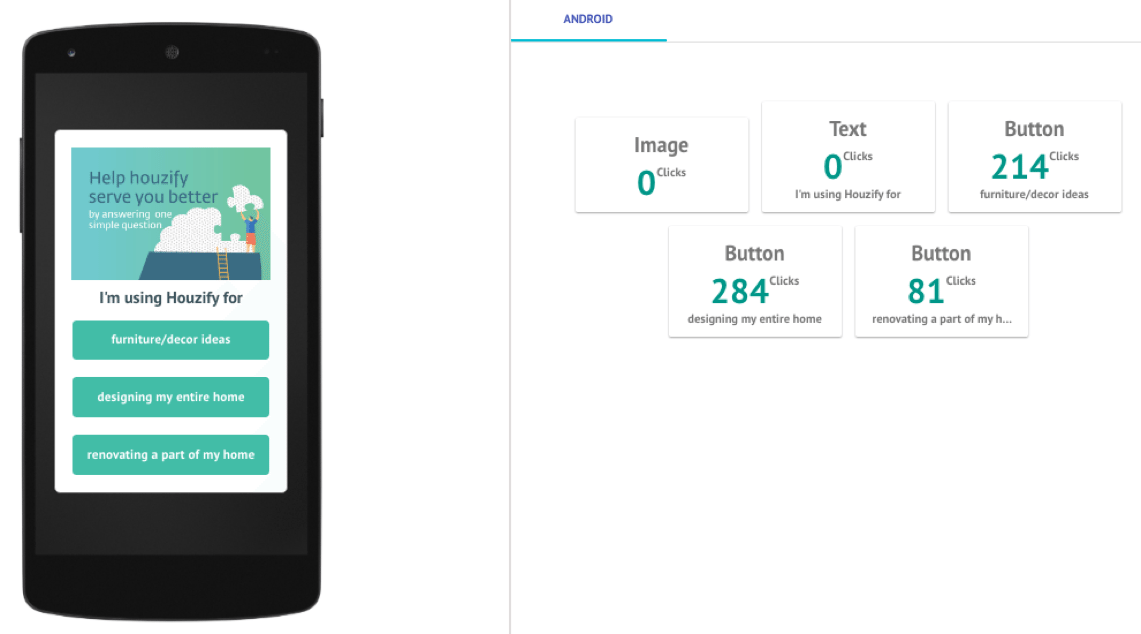
Understanding analytics can allow you to be more effective and prevent risks of delivering in-app campaigns that could annoy some of your users. Deep dive analytics can tell you everything about what users liked in your in-apps. Track key metrics such as clicks – where users clicked and number of clicks and conversions to see how users are interacting with your in-apps.
In this example (image below), you can see that users have clicked on either of the buttons and not on the text or the image meaning, the in-app was successful in driving the desired action. These metrics tell you exactly how users view in-apps and with this data you’ll be better placed before you deploy your next campaign. Using analytics helps understand which in-apps work best with your users and you can try to replicate this success in future campaigns.
Frequency capping and time between in-apps
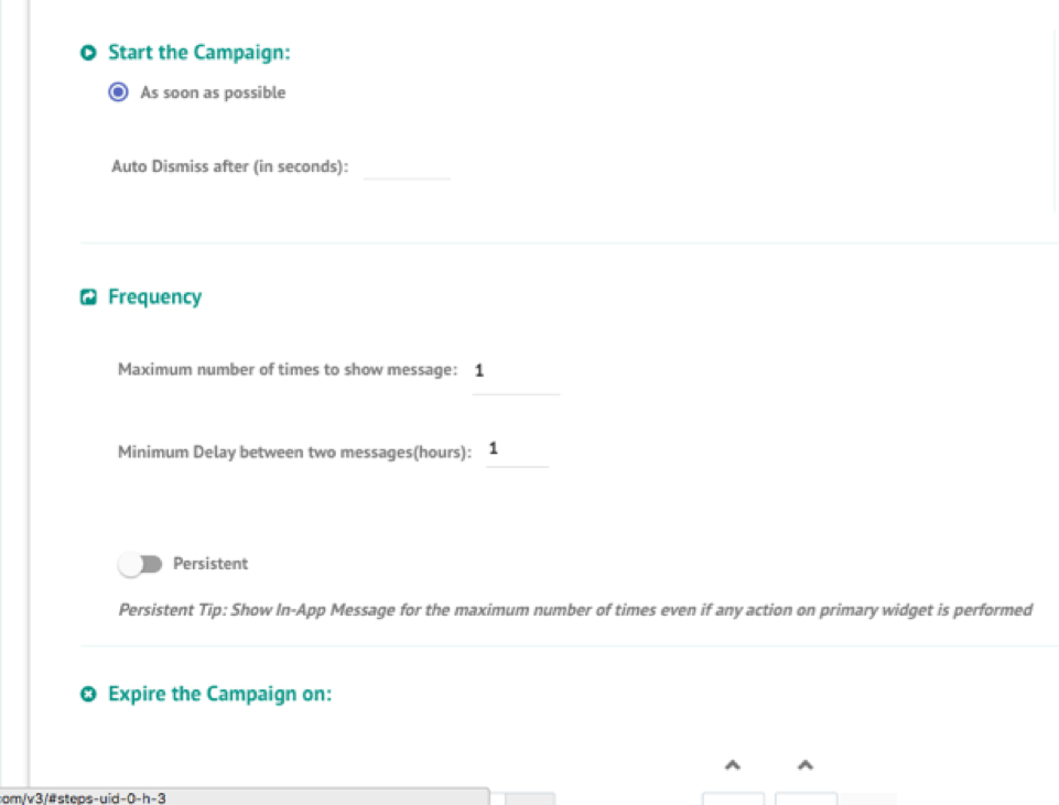
This is crucial for most marketers as too many and too frequent in-apps could result in a poor app experience for users. It is important to focus on what users want to see than what you want to show. Use settings such as frequency caps to limit yourself from disrupting your users on the app leading to a more receptive app experience. Remember, the objective with in-apps is to always add value to a users’ app experience rather than disrupting it.
To learn more about how we can help you drive your in-app campaigns, get in touch with us to provide you with a personalized demo.

