Firefox Hides Web Push Notifications: 2-Step Combat Plan For Brands
Reading Time: 11 minutes
|
Is the end of Web Push Notifications upon us? There has been some talk going around, and we’ve been cognizant about it.
The speculation is based on an announcement by Mozilla that states, come 2020, all push notifications on the browser will be hidden by default. It also goes on to say that users will be able to block push notifications, not just for now but for forever.
| Bonus Content 👉 Learn How OYO Boosts Push Notification Delivery by 44% [Case Study]👉 Definitive Buyer’s Guide To Customer Engagement Platform [Ebook] |
Are the speculations really true? If yes, are there other channels that can be leveraged? What should brands do to be ready for this change?
In this in-depth article, we will answer most questions you have in mind about the topic.
To begin with, let’s show you what this change would look like:
What does the change look like?
See this gif below from Mozilla Firefox Nightly.
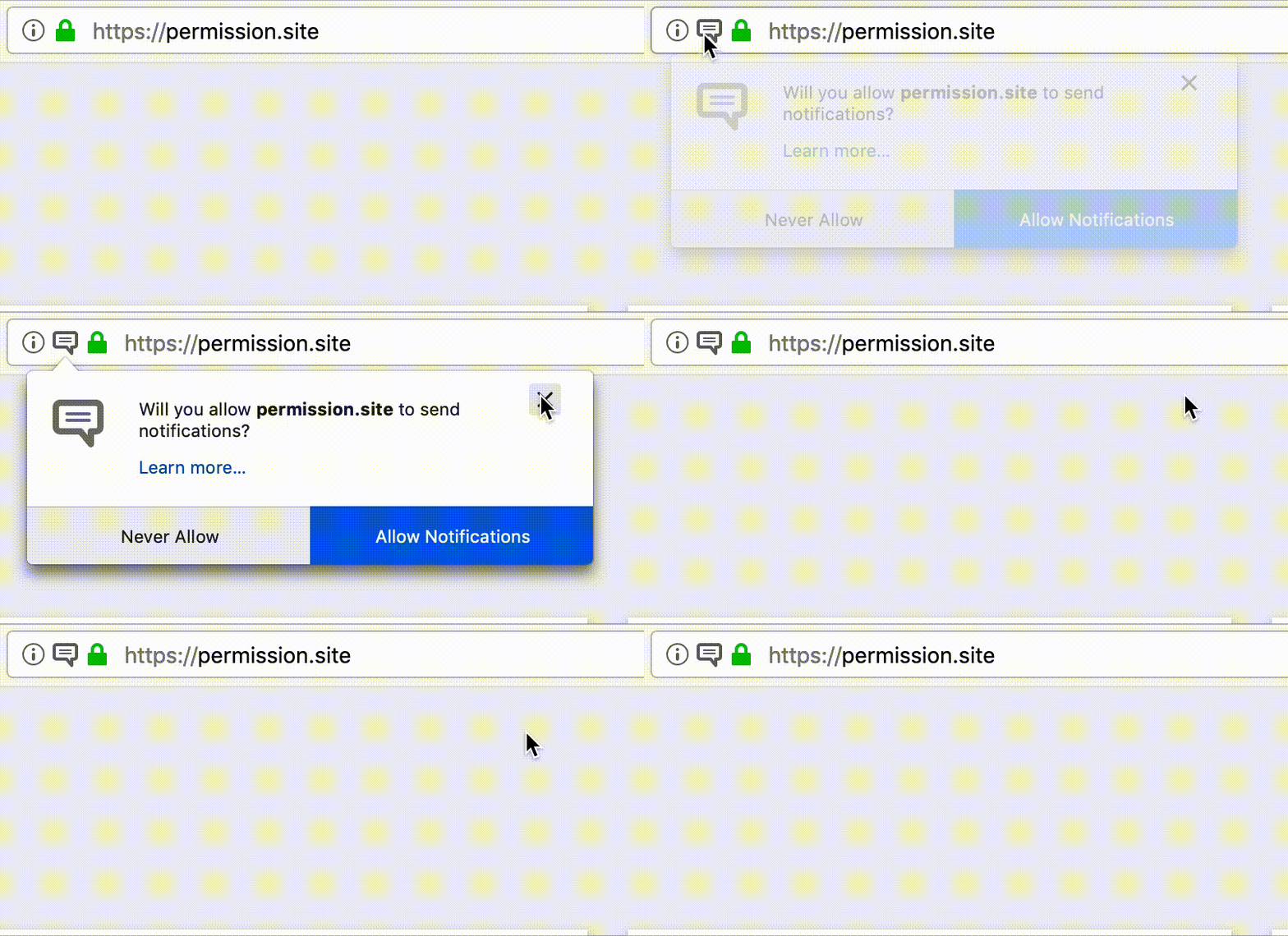
According to the report published in The Indian Wire, this same update will be available to users of Firefox 70 and the forthcoming Firefox 72.
The Firefox 72, by default, will block the pop-up for a notification when you enter a website. When the website sends a notification, a permission box will appear on the URL bar. To see the pop-up the user needs to click on the permission bar.
Additionally, the Not Now option will be replaced by ‘Never Allow’.
This decision is definitely a step ahead for seamless, distraction-free web surfing. But at the same time hurts your web push campaign by quite a bit.
Will other browsers follow suit?
Mozilla’s Firefox has a small share in the pie for all web browsers globally – around 4.3%. And this move could very well attract some users from the bigwigs – Chrome and Safari.
Microsoft’s Edge browser recently announced changes for Chrome notifications which hides them by default.
But lately, similar features have been spotted in Google’s Chrome and Android platforms. In fact, XDA-Developers have claimed of identifying a flag aimed at modifying the notification prompt.
Following is an actual comment snippet found by XDA.
|
When a site wishes to show notifications, the usual modal dialog is replaced with a quieter version.
#quiet-notification-prompts
So, here’s the deal – not all is well with web push notifications.
Quite frankly we’re not surprised to see this.
It was only a matter of time before brands started exploiting the high engagement rates on this channel. Rather than being value-driven and specific, a one-size-fits-all push campaign can annoy users.
So what really goes on inside a user’s brain? What are the triggers behind a user accepting or blocking a push notification?
We conducted research around it. The following section tells you the results.
Why users don’t want to subscribe to web push notifications?
Simple keyword research around chrome notifications gives you this:
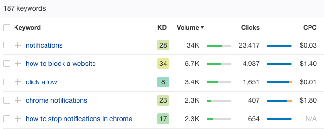
The search volume speaks for itself. Around 2.3k people specifically search ‘how to stop notifications in chrome’ on a monthly basis in the United States alone.
We conducted a survey on why users find these notifications annoying.
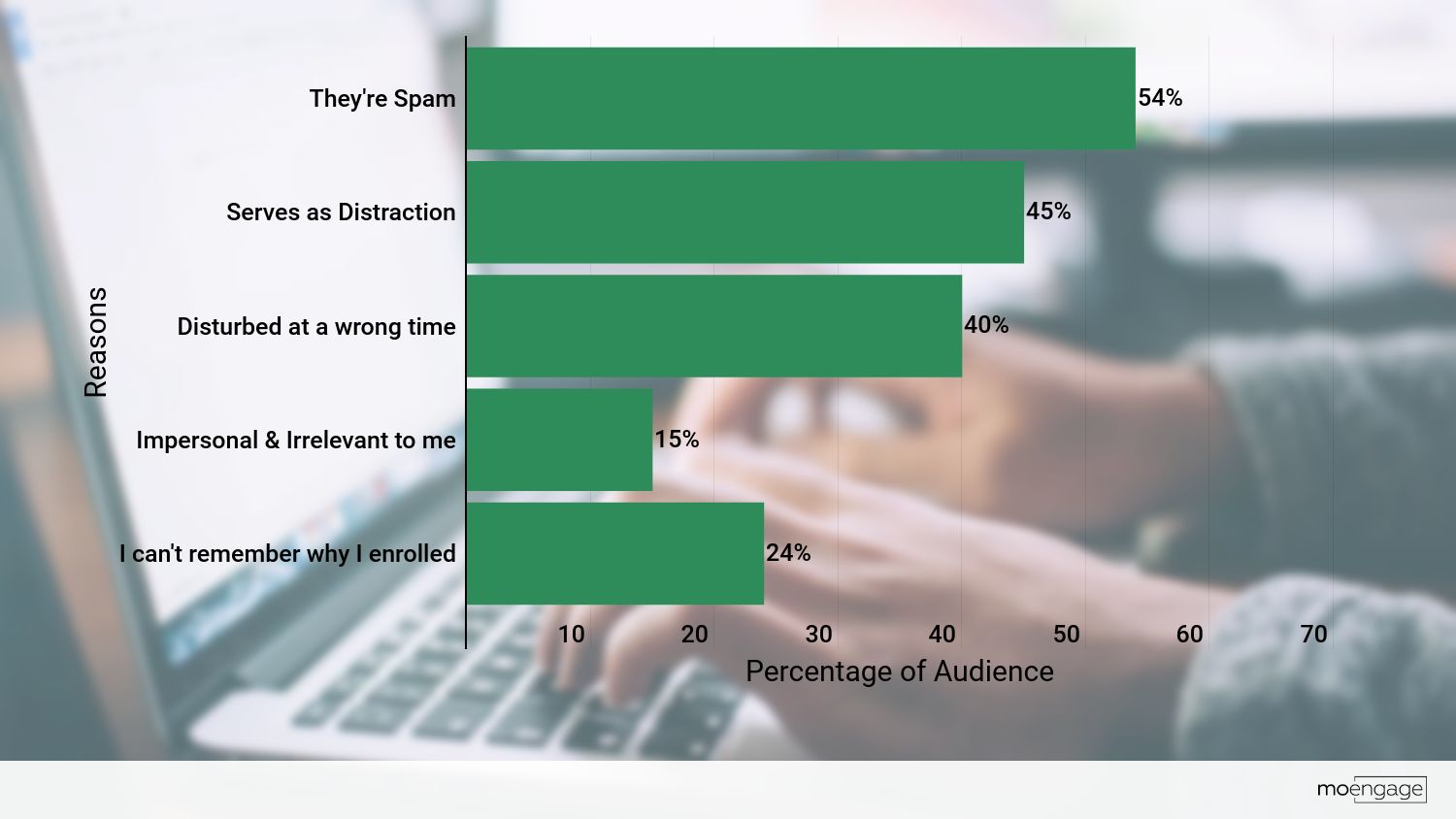
Close to 54% of the surveyed users who disabled the notifications feel it’s a spammy service. No wonder so many people, wanting to get rid of the menace, googled those words.
45% feel it’s not productive to keep these notifications activated since it adds to their distraction.
A considerable dataset – 40% say notifications are sent at an inappropriate time. Sure enough, you don’t want to be in the middle of a client presentation with a notification from 9GAG showing up on your screen.
Around 15% feel it’s impersonal or irrelevant to them.
Furthermore, 24% say they can’t even remember why did they allow the notifications in the first place.
What does this mean for a brand?
Brands across industry segments use web push notifications for different use cases. Primarily it helps them keep a tab on the anonymous user-base. Or it also serves as a channel to engage with customers and keep them coming back to the website through relevant alerts. Mostly, web push notifications, serve as a channel that helps brands showcase what they’ve been up to when their users were not looking.
And that was working fine, until one day we realized that it was too good to be true. As the number of push notifications increased and the screen space decreased, the demand for quality and the number of unsubscribes both increased by leaps.
Our research has helped us find insights and formulate an action plan that brands must employ.
Here’s the 1st step:
1
Refine your existing web push notifications strategy
Chrome and Safari have still not gone official with stricter norms around web push notifications.
Now is the best time to:-
- Polish your existing push notifications practices (and implement new push notification best practices!)
- Reduce dependencies on Web browsers alone for driving registrations.
The top 6 ways to put this strategy into action:
-> Keep away from impersonal, generic content
A push notification that’s not custom made with a special message, emoji or picture will repel your users then attract them. Generic push notifications feel spammy. 7 out of 10 times the automatic response to is: ‘Not Now’ or ‘Block’. Make a notification that sticks to their memory.
The following video explains how we help our clients achieve personalization in their campaigns.
-> Time your notifications to perfection
Irrelevant push notifications don’t work. In fact, they push your user base to click ‘Unsubscribe’. It’s time you put some thoughts behind the when(s), where(s), and why(s) to alert your viewers. Blanket campaigns are a strict no-no.
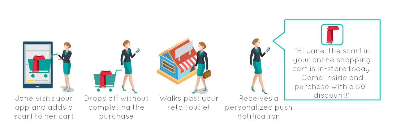
For example, A user looking to spend a family vacation in Hawaii would prefer to see hotel listings with connected rooms, or entire villas as compared to hostels. Another example is that of timely notifications sent by a cab-hailing app to a user who lands in geography away from home. Such practices raise the probability of interaction by as much as 200%.
-> Placing the notifications at right instances
Placing the notifications is an important factor that usually gets sidelined. In fact, placement becomes all the more important to track and register users in different phases of the sales cycle. Broadly we can distinguish users on your website into 2 main categories:
- First Interaction: Users that have just landed on your website. As a general courtesy, wait for a good 3-7 seconds before you ask them to register. Let them have a look and feel of your website header and content. By delaying the first notification you not only increase the chance of getting more registrations but also come across as genuine or spam-free.
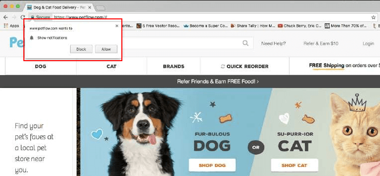
- In-Cart Interaction: Once the user adds few products to their cart or clicks on a CTA to interact or completes reading a blog, their chances of subscribing to a push notification increase by 800%. The user is more likely to allow web push notifications in order to stay updated. You could also leverage slide-in pop-ups here that can easily be minimized (more on this later).
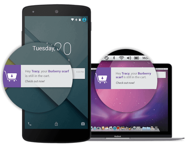
-> Make your notifications actionable or intriguing
Do your push notifications ask the user to take action? Or just intrigues them with something that gets them thinking?
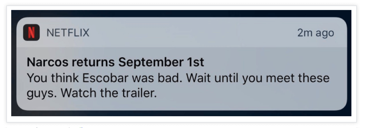
Take cues from Netflix
|
Here’s the thought train:
Who’s the new Don on the block who could beat Escobar? -> Seems interesting -> Let me just watch the trailer for a while.
Distracting? Probably Yes! But then that’s the industry Netflix is in. Their primary enemy is sleep not any other on-demand video platform.
-> Make useful or value-oriented notifications
Probably the most important umbrella tip for any notification is to make it useful for the user. There are plenty of ways to do it. Inform about a price drop of an in-cart product. Give your user a heads-up about getting out in time for a planned travel itinerary. Track and remind them to stick to their weekly fitness plan. The more useful your messages, the better.
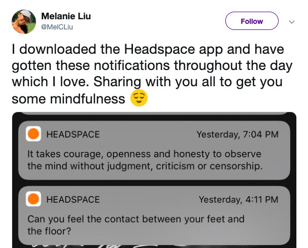
Check out how Headspace nudges its user base to be mindful of its surroundings.
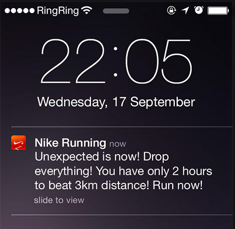
Here’s Nike Running reminding the user to finish the deadline he/she set for themselves.
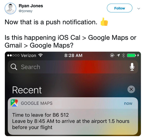
Or the plain simple Google Map notification asking you to get out on time for your forthcoming flight.
-> Don’t overdo the frequency of notifications
Like with most other blessings in life, count the number of push notifications you send. Research is done on Push Frequency vs Unsubscription rates (by industry) states that more than 10 notifications in any industry jump the unsubscription rates by as much as 300%.
Even sending timely, relevant, useful, and personal notifications more than a couple of times can be dangerous to the entire campaign, skyrocketing the number of unsubscribes.
How do you decide the optimal frequency of push notifications?
Unfortunately, there’s no magic mantra that can help you here. However, this gives you the license to experiment and find your own sweet spot with your target audience. Moderation and experimentation go hand in hand. Tools such as Moengage’s Push Amplification can help you here to make the right data-driven decision.
Now that we know how to refine our existing Push Notifications strategy, it’s time to diversify your opt-in promotion strategy. This helps you to decrease your dependency on internet browsers alone for new registrations.
2
Cross channel opt-in strategies
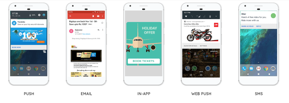
You’ve other channels at your disposal – pop-ups, emails, SMS, etc. Once you start building a vibrant marketing channel, it doesn’t hurt to promote one of your other channels. For example, ask your email subscribers to opt into SMS alerts for features such as urgent price drops.
Ask your SMS subscribers to give your email lists a chance if they like what they read here. Furthermore, ask your email subscribers to register for web push notifications and stay updated.
 However, make sure that you don’t come across as pushy either in tone or frequency.
Looking for best practices across channels that will pave your brand’s way towards a healthy, symbiotic omnichannel marketing campaign?
Let’s speak about the top 3 channels and how you can best work with them:
-> Emails
According to the Radicati Group, there are close to 2.9 Bn Email user’s rights now. Each of your anonymous users on the website has an email.
If you thought Email Marketing is dead, think again. Emails still show better CTR and open rates than most social media platforms. In fact, they stand second only to SMS when it comes to open rates. Take a look at the below stats from Optinmonster.
The other advantage of communicating with your users over email is the longevity of a quality conversation. Don’t treat your emails as fliers with flashy images and CTA buttons but hand-written letters that take the conversation to other channels as well.
Make the tone friendly and encourage them to participate with their thoughts and replies. Personalize your emails by addressing them in first-person. Re-work your subject titles. Your emails are only as good as the Subject line. A proper subject line increases the probability of opening it by 80%.
But before we take the conversation to email, you must be thinking about how do you get the emails of all the anonymous visitors to your website. This brings us to the next channel: Pop-Ups
-> Pop-ups on your website
We’ve all been there – struggling with the website UI to close a huge pop-up that blocks everything underneath. In fact, certain websites gate their entire content with ‘login to read’ features.
And worst of all, when users put in their details, it redirects them to a Thank-You page which they didn’t ask to be taken. 1 more click on the ‘Back’ button to land on the page you wanted.
Today’s internet user doesn’t have so much time up his/her sleeve. A simple solution is to integrate login with Google/Facebook feature onto your website. This is as simple as a 1-click feature.
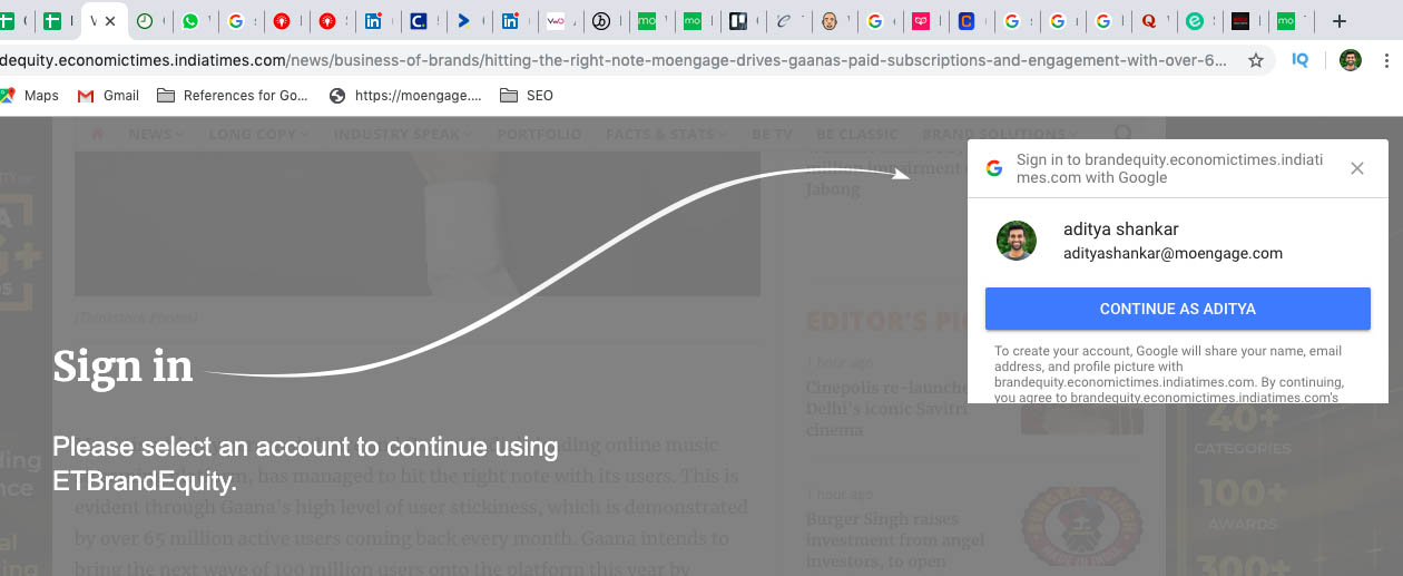
Users are more likely to continue by logging in to a service they already trust or use. According to Janrain close to 80% of logged-in users are distributed between Facebook and Google.
By doing this you also save them from the pain of creating a new user account and the ‘password fatigue’ syndrome.
To further make your point tell your user why they should log in to your website. An incentive for tailor-made recommendations or even a promise of not sending a lot of emails/messages works here.
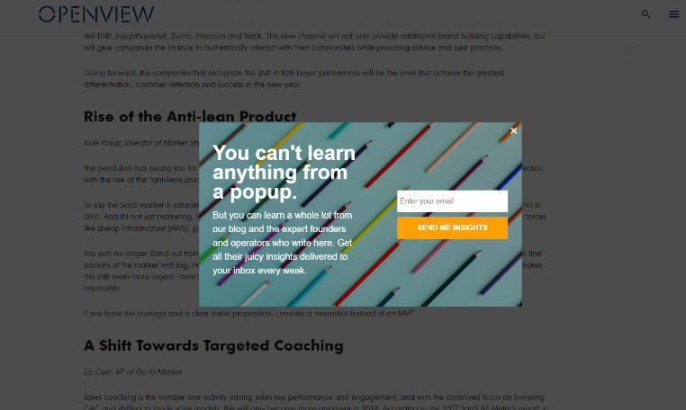
There are 4 main kinds of pop-ups:
- The classic,middle-of-the-screen lightbox, pop-up
- The Slide-in
- The Bar
- The full-screen pop-up
You can use either one or a combination of them depending on the visibility requirement. A full-screen pop-up should be engaging, easy to close and lead generating.
Lightboxes and Slide-in(s) are easier to close and are less probable to come across as a nuisance. The horizontal bar is omnipresent and usually sticks to the top or bottom of the screen.
Exit-intent popups that lure the visitors with a valuable resource such as an e-book are proven to show increased engagement. Slide-ins with suggestions to what to read next come across as authentic. They help in overall navigation across the website and help increase the time spent on the website per visitor.
Note: Pop-ups run on a very sharp knife edge of being classified as spam. Be selective in their placement and type. Placing a webinar registration pop-up on a blog resource that talks about the same topic are bound to show increased engagements.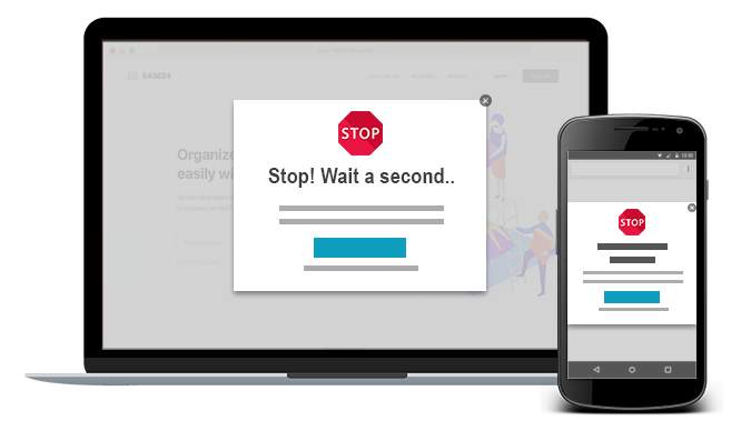
-> SMS or Text Marketing
Am I serious? Who reads Text messages anymore?
Well yes, I do. And with an open rate of 98%, I’m sure plenty of people still read them.
Take a look at these data points from Tech Jury:

Now that we know SMS Marketing is still alive, it’s time to set some ground rules for a prospering campaign.
- Don’t send texts simply because you can. Worse than not having an SMS campaign is to have a generic campaign that shouts about your products day in and out. Getting the phone numbers of your prospects is an easy task. Stopping yourself from using this channel as a broadcasting medium is a difficult task.
- Why SMS and not Email? Ask this question before you finalize the copy of the text. If it’s not time-sensitive or urgent you’re better off taking the conversation over Email.
- Get permission. Ask your users to opt-in by sending a code. This is mandatory not only from a regulatory point of view but also from a usability pov.
- Send only those kind of messages that the user opted in for. Don’t tell them about new products, or referral schemes. If the user wishes to be alerted only about flash sales, respect that.
- Keep it short. 160 characters only.
- Personalize the copy.
- Send instructions to opt-out.
- Limit the frequency.
Conclusion
With internet browsers cracking down on web push notifications, it’s more important than ever to have a relook at your push campaigns. How do you make them effective? By being timely, relevant, useful, and personal.
You should then leverage other channels like website pop-ups, Emails, and SMS to drive registrations. We discussed best practices for implementing each of these channels effectively.
We also took a look at how cross-channel promotions to drive registrations for your push campaigns are a definite must. This reduces your dependency on web browsers alone for driving new registrations. Furthermore, these strategies will help you unmask the anonymous users visiting your website and make them your loyal audience.
Here’s What You Can Do Next
|

