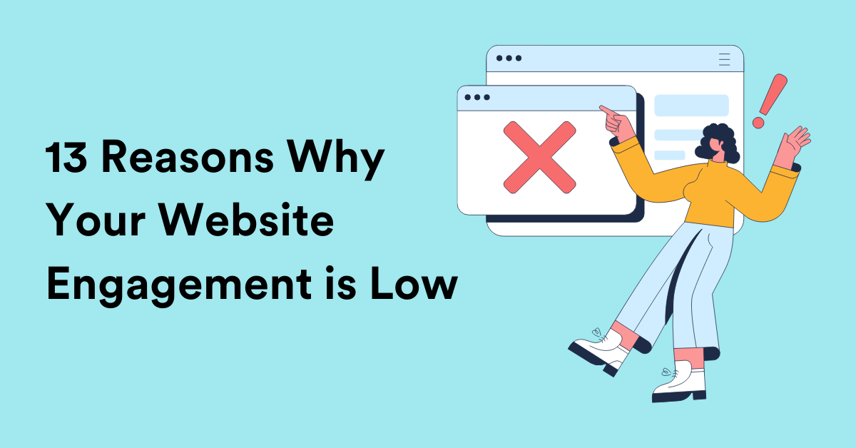
13 Reasons Why Your Website Engagement is Low!
and How to Fix That!
Reading Time: 8 minutes
Have you ever worked really really hard on a website for your business and seen no (or a negligible amount of website traffic) engagement?
Customer engagement remains one of the most common problems for most companies.
According to Statistica, consumers need just 50 milliseconds to understand whether they want to leave a particular platform or stay.
A successful website with enough website engagement acts as a lead and sales generation tool. If it is not engaging enough, it is time to make some modifications.
In this blog, we’ll look at the most common reasons why there’s no engagement, eventually tweaks that will help increase overall customer engagement across the website, and also possible solutions to decrease the bounce rate.
Outdated Design Can Affect Your Customer Engagement
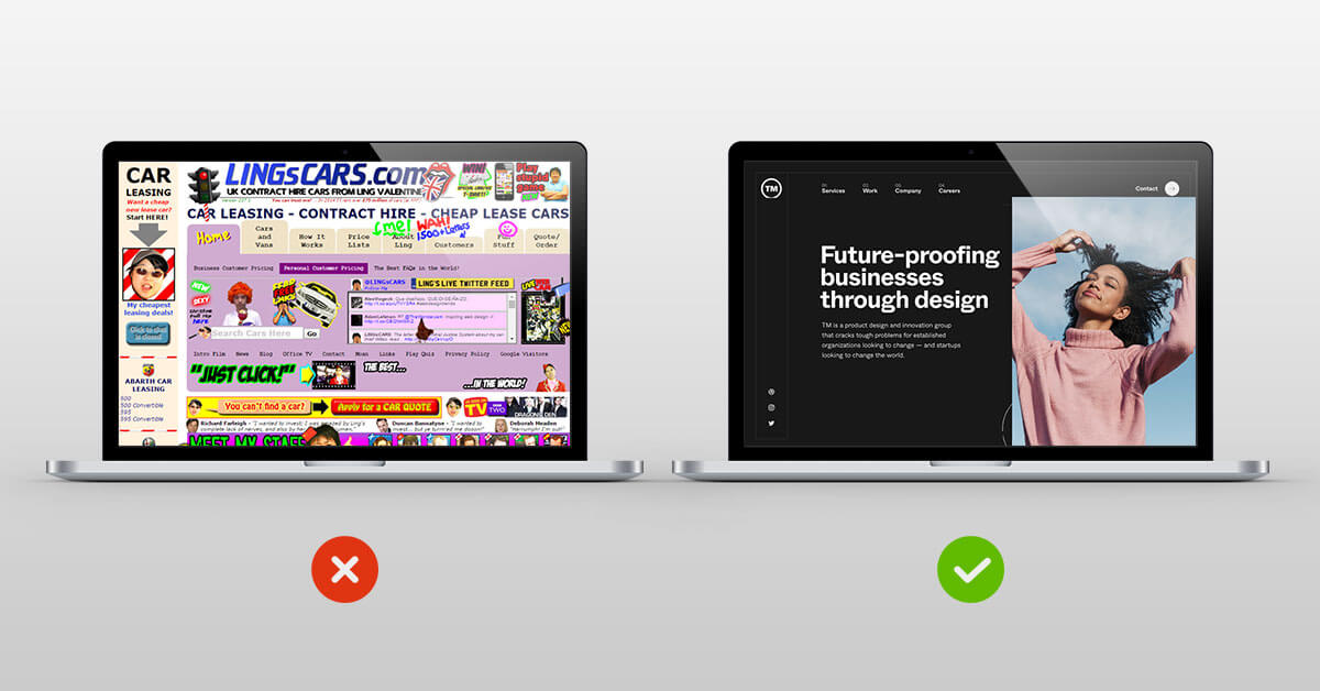
Let’s start with the basics.
Website design.
Strangely enough, very few companies pay little to no attention to their website design.
You’ll be amazed to know that 46% of customers stated that how a website looks is a determining factor when it comes to ‘business credibility.’
Websites that are not user-friendly can scare off your potential leads and make them prefer your competitors over you! Now, that’s the thing that you wouldn’t want, right?
One of the easiest ways to go about this is completely overhauling your website design or hiring a professional web design company. These website design companies or development agencies consider your website’s user experience and user friendliness before suggesting changes.
Slow Loading Websites
Now that your website considers the user-friendliness of it all, it’s time to check the loading speed!
For the uninitiated, a website loading speed is defined as the total time the website takes to display the information given on any web page. This is also called page load time and can be one of the major deciding factors in increasing user engagement.
Websites that load too slowly are a shared pet peeve for many users. In such cases, where the web pages load slowly, it can be detrimental to potential customers, who view the business as dated or as a website that doesn’t function well. And, none of the reasons contribute to good customer relationships.
Fun fact: More than 47% of website visitors expect a website to load in less than 2 seconds. And more than 40% of visitors would leave the website if the loading speed is more than 3 seconds.
You can use a speed checker if you don’t know whether your website has an optimal loading speed in search engines.
The most reliable instruments are GTmetrix and Web Page Test. Once the scanning is over, you will receive precise recommendations for improvements. This is one of the most efficient ways to increase the customer’s time and engagement with on-site visitors.
No Mobile Website Optimization Done
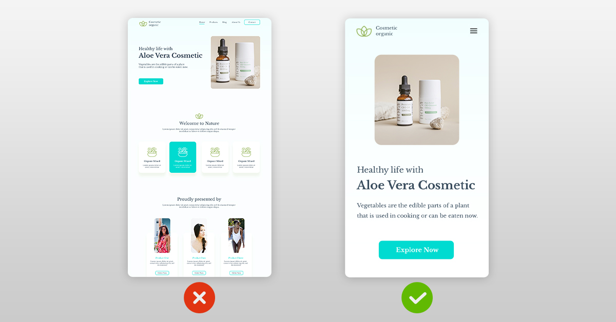
If you start checking your Google Analytics or another analytics tool, it will show that the maximum customer engagement happens over mobile devices.
Here’s the thing: if your website is not optimized for mobile users, you can lose out on potential customers. Besides, according to the recent Google update, your website needs to be mobile-optimized if you would like to rank.
Lastly, a mobile-optimized website is considered to increase customer engagement and see faster conversions from the engaged customers.
If you are wondering how to start getting your website optimized for the mobile phone, here are a few hacks:
- Make your website design responsive to increase customer engagement.
- Add easy-to-find CTA, ensuring that users experience streamlined navigation across the platform whenever they interact.
- Simplify your demo or buy forms.
- Lastly, optimize your file sizes, including images used in any blog post.
Confusing Navigation That Confuses Website Visitors
There’s a simple rule: The simpler it is to find your products or services, the better it is!
Anything else can confuse your visitors, lead to lesser user engagement, and eventually leave your website. If your user experience is confusing, it can affect your overall SEO and SERPs.
To understand whether your website has clear-cut navigation, visit your website as a new user and try to answer these questions:
- Is it easy to find any information on your website?
- Is it easy to find the relevant products and services?
- Does your website have a clear structure in the header and the footer?
Remember, when overhauling your website navigation, you must keep your user engagement and needs.
If you are still wondering how you should boost engagement, you can check out UserTesting, Maze, LookBack, UserZoom, etc. All these tools will help you determine customer engagement and whether your site visitors are satisfied with the website.
Absence of ‘About Us’ or ‘Contact Us’ Page
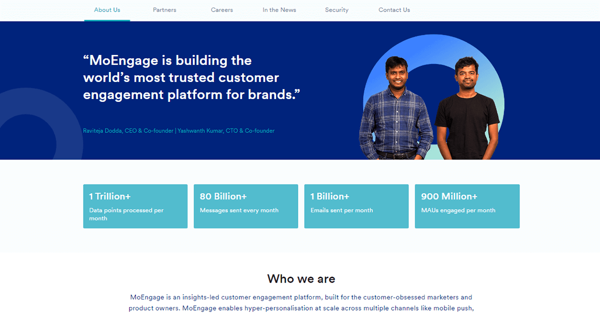
Your customers want to know you before they take the final plunge. To satiate this ‘knowledge,’ include an ‘About us’ or ‘Contact Us page on your website.
These two pages help with the following:
- Builds credibility,
- Builds trust
- It also allows your customers to reach you via their preferred communication channels.
Not having such pages on your website can affect your overall website engagement.
To begin with, use a website engagement tool or even Google Analytics to figure out which website pages are most visited. Next, check your brand queries to understand what your customer wants from a ‘contact us’ or ‘about us page.
Once you have the website engagement metrics and the search query data, use it to create a website page that best defines your brand. Then, create a page with contact details, addresses, telephone numbers, customer support email, and your brand’s mission and vision statements.
Remember, building a rapport is easier when your customer knows the real ‘you’ behind your brand.
Annoying Ads and Pop-ups That Scare Your Site Visitors Away
A Hubspot survey states that 73% of respondents dislike pop-up ads, 70% hate dealing with mobile ads, and 57% are annoyed when ads play before content loads.
The above data should be enough to get your alarm bells ringing! But not all advertisements and pop-ups are bad.
Here’s the thing: if your pop-up is spaced out to pop up only when the site visitor is not engaging enough or leaving your website, it can be good!
If yours is an e-commerce site and your pop-up talks about an offer or a discount, your customer would love it!
Similarly, if your ads are about your industry, and you create content that your visitors find interesting, it IS OKAY!
What will, however, annoy your customers if you have too many of such pop-ups or too many ads that act as a distraction.
To find a balance, you can use pop-ups on exit intent and your ads as a place to mention your interactive content, like lengthy survey forms, reports, or ebooks that increase engagement.
No Call-to-Action Buttons
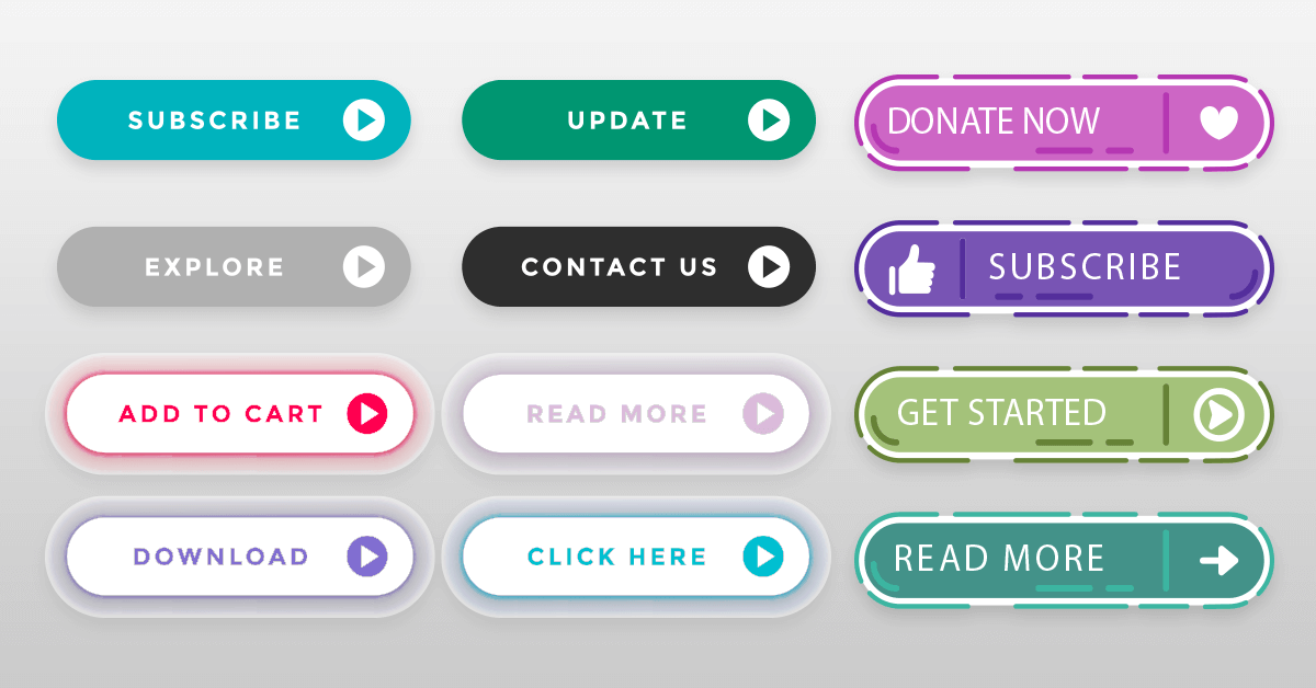
Imagine this; you have a product page designed in such a way that it drives a lot of web traffic. But once your customer lands on the page, you don’t have a CTA button!
There’s no rule regarding how your CTA buttons should look. Everything depends on the specifications of your company. For instance, you can write ‘Subscribe to Our Newsletter,’ ‘Download a Demo,’ or ‘Order Now.’ The main idea of such motivating text is to focus customers’ attention on the provided possibilities and entice them to go further.
The above examples will help lead generation, as your website customers will know what to do next.
You can be as creative with your CTA button web element, but remember to place your CTA buttons in strategic places to improve customer engagement.
Unappealing Content
One of the other reasons why your visitors are not engaged with your website is directly related to the type of content shared.
To increase customer engagement via content, begin with qualitative research addressing your user’s needs.
If you are wondering where to start, here are a few ideas:
- Improve your website engagement with a blog section that answers your customer’s problems or gives them current insights into their industry.
- A case study section also helps increase user engagement as it gives information and builds trust.
- Any kind of social proof, like customer testimonials, also improves website engagement.
- Interesting videos and images help to engage visitors.
- Also, include a social media feed that your readers can use to interact with your brand.
Missing Chat Functionality
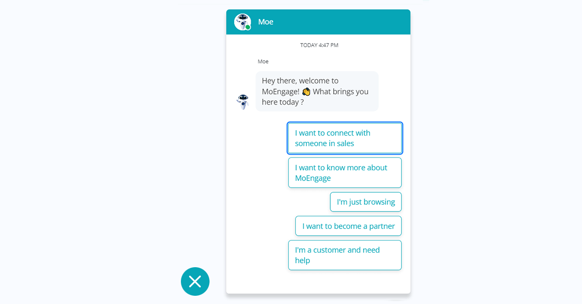
Sometimes, your customer may want to chat with the company representatives directly. One of the fastest ways to implement this is a chatbot or a video chat option on your website that addresses the queries of your new customers and your other users!
Besides giving information and solving queries, some chatbots can share relevant content with returning visitors, provide the ultimate context for case studies, etc., directly improving customer retention rates.
Readability Issues Leading to a Bad Customer Experience
When considering engagement strategies, the focus mostly remains on colors, images, and graphics. The text is always almost forgotten. It’s time to consider your ‘fonts’ and ‘font sizes’.
To increase user engagement, begin by understanding how the content on the website is perceived. You can do this by running A/B testing via some lengthy surveys or using engagement tools that will help with such web elements.
While Comic Sans is simply a no-no, go with color combinations that are clean and have high contrast.
If you’d like a simple serif, sans-serif fonts also often do the trick!
As for the size, opt for larger fonts so customers can easily read the text on desktops and mobile devices. 22 px or larger is suitable for headlines, while 14 px or slightly bigger works best for body copy.
Yours is an Unsecured Website
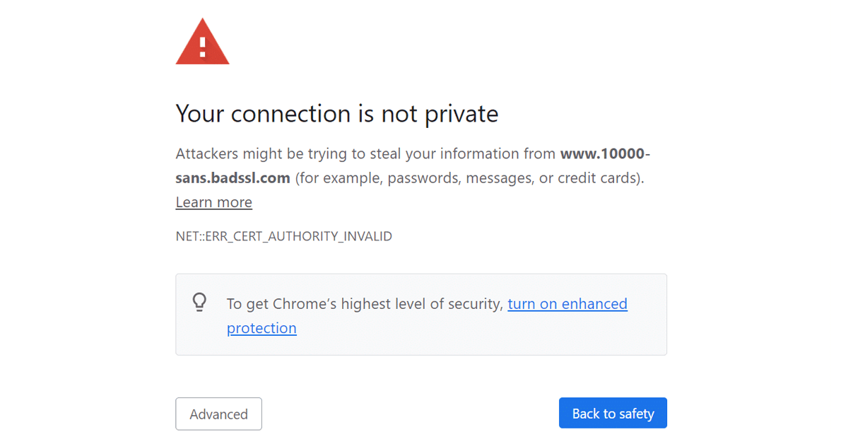
Does your website have a security warning?
Does it show compliance policies on the page?
Does your website have a security page?
If the answer to any of the above questions is ‘no,’ it’s time to rethink!
Even if your page loads instantly, if there’s a security warning, your visitor might exit the page. According to a British study, 64% of users would leave the website immediately if a “not secure” warning appeared.
One of the major signs that a site is insecure is the absence of an HTTPS certificate, which immediately causes a “not secure” message displayed next to the URL. If this certificate is installed, all visitors’ data is tucked away.
Audio or Video Auto Play
One of the last reasons why you do not have website engagement is that your video and audio files load automatically.
The auto-load of video files especially can test the most patient of your visitors. Besides, such embedded components severely decrease loading speeds. In most cases, when customers see such an irritating element, they scoff, roll their eyes, leave the website, and go to your competitor’s page – and there goes your website engagement!
Ensure that autoload is not turned on to give back people control over their surfing experience. Alternatively, you can always put a ‘play’ button on your video so those who’d like to see it can do so without interruption.
Not Segmenting and Reaching Your Users According to Their Preferences
One of the things that most website owners disregard is segmentation. Proper segmentation improves website engagement. Period.
To begin with, understand what your customers are looking for when they land on your website –
- Are they looking to contact someone?
- Are they looking for the latest updates on your products?
- Have they visited before to check whether they are the right fit?
- Are they looking for a compliance policy?
- Do they want to know more about the latest offers and promotions?
Break down your customers depending on their preferences or past behavior, and you can then trigger web push notifications or pop-ups. This will help the customer to navigate and overall improve your website engagement.
Ultimately,
Your Products = Customer Needs = Happy Customers = Improved Website Engagement.
Final Thoughts on How to Improve Website Engagement
If you crave website engagement, here are a few things that you should do:
- Improve the website page loading time. Use the speed suggestions given in the tools. Make sure it’s less than 2 seconds.
- Make sure your design is compliant with your site speed requirements.
- Your website should be mobile-friendly.
- Try and keep straightforward navigation for your user engagement.
- Avoid adding too many pop-ups or even auto-load videos
The idea is to keep your customers happy and provide them with the experience they seek. This will lead to extended stays and improve your overall website engagement.

