[UI Revamp] We’ve Got A Great New Look
![[UI Revamp] We’ve Got A Great New Look](https://www.moengage.com/wp-content/uploads/2021/10/Feature-1-2.png)
Reading Time: 4 minutes
σχέδιο. That’s the word ‘design’ in Greek, pronounced ‘schedio’. And why are you reading about this random piece of information? That’s because our latest update is all about ‘σχέδιο’. We’ve redesigned the entire MoEngage experience to make it easier and faster for you to craft engagement campaigns for your customers.
Why the redesign?
Over a year ago, we revamped our brand and website. Today, we’re taking the next step by rolling out this new visual identity inside the product. Along the way, we put our ears to the ground and listened to you. Some of you said that the platform was simple and easy to use, and others pointed out a lack of uniformity across channels. This arose because we built different platforms progressively, not all at the same time. Nonetheless, we heard you!
Around the same time, our engineers told us we were on a technology that was slow and tedious—and that there were better alternatives out there. Immediately, we started the research, found a great alternative, and started the mammoth task of migrating to a new technology.
So—that is how our redesign began—and that leads us to today! You wanted better, so we’re giving you better than better. We’re giving you the best in the industry.
How will this benefit me?
The MoEngage platform is now more intuitive than ever. We’ve filled any usability gaps you may have been encountering, to make every interaction seamless. We’ve structured and categorized all processes to make navigation clearer. More importantly, we’ve switched our backend from the Angular Javascript library to React—so the backend is more scalable, configurable, and delivers better performance and load time.
Alright. Tell me what’s changed
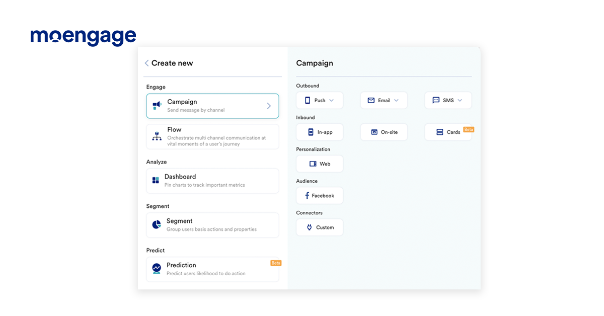
Uniformity across campaign creation
We’ve changed the user interface for creating campaigns. You’ll now notice consistency across all channels of the MoEngage platform. This means that the way you design your email campaigns will be the same as the way you design your SMS or push campaigns.
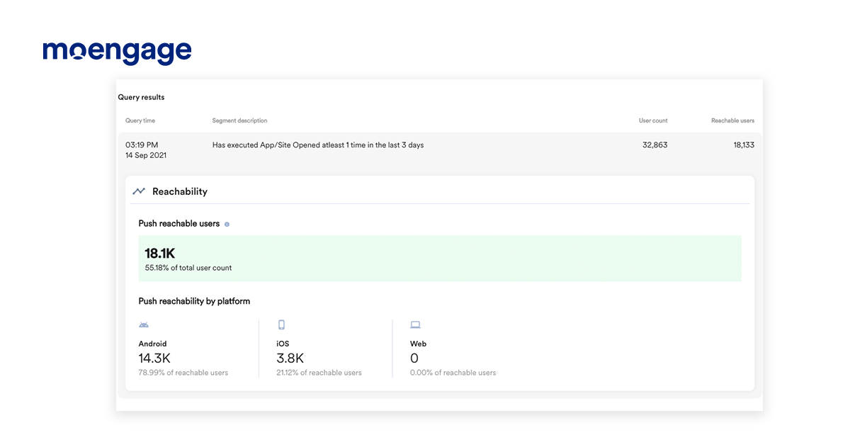
Count your reachable users
For any segment of users, you can get a count of the number of users reachable via email, push, and SMS. For push campaigns, it will be displayed when you click on the ‘Show count’ button during campaign creation. This handy tidbit will help you decide which channel to send your campaigns over.
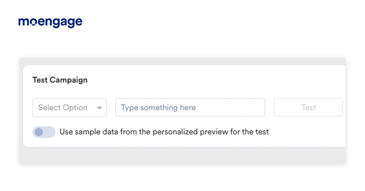
Test campaigns without the back-and-forth
Earlier, the facility to test your campaigns was present in Step 3 of campaign creation. With this new update, we’ve moved the ‘test campaign’ facility to Step 2 of campaign creation, so that you don’t have to go back and forth to test and make changes.
Okay. Now tell me about the channels
Here’s what’s changed with Email:
- CC and BCC fields are now displayed separately. You don’t have to worry about BCC’ing the wrong person now!
- You can navigate to the next step using the new navigation bar on top.
- Attachments have been moved to a separate section.
- All email details are now in a collapsible menu, giving you more space to design your email.
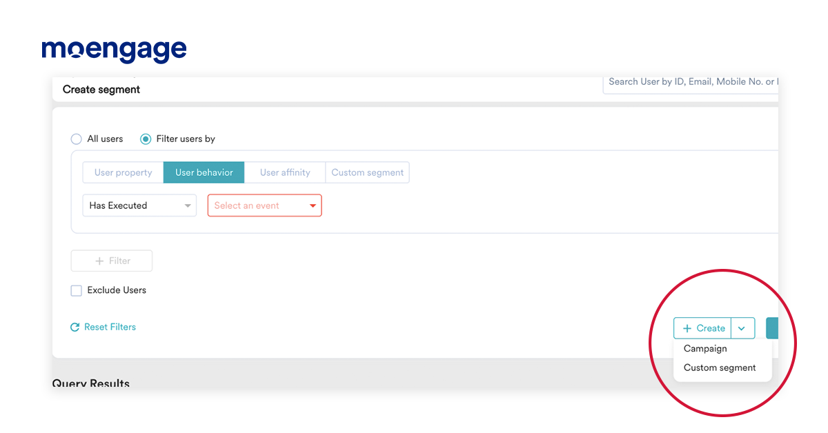
- You can now create email campaigns right when you’re creating segments. Woohoo!
And here’s what’s changed in Push:
- You can now copy and paste your message between platforms with just one click. So if you’ve written up the content for your push message in Android, you can instantly copy-paste it into the iOS tab.
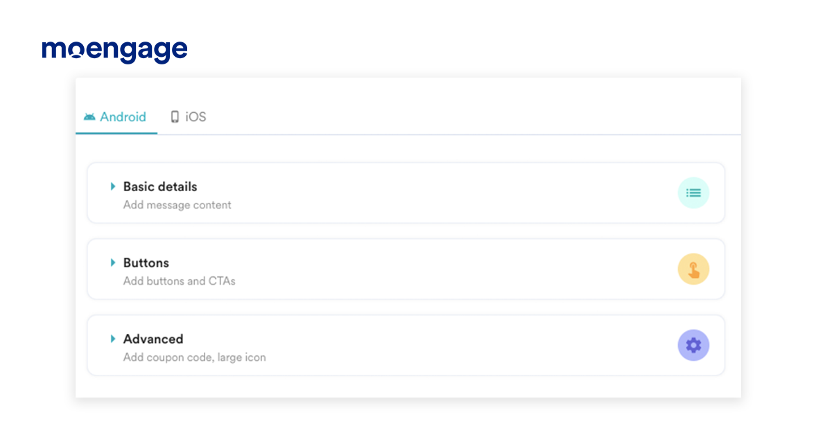
- All the information you need to create campaigns is now available in vertical, collapsible tabs for quick discovery. All mandatory fields have been grouped together so you don’t have to switch between tabs.
- Get field validations in-step without needing to click on the ‘Next’ button.
- Conversion goals are now optional, which means you can make a campaign live without adding conversion goals.
And we haven’t forgotten about SMS
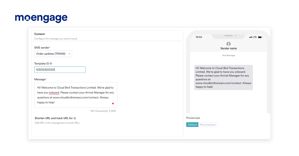
- You can now define start and end times for event-triggered SMS campaigns.
- Previews are now available for SMS too!
- Conversion goals are optional for SMS as well, which means you can make a campaign live without adding conversion goals.
- URLs are auto-detected for shortening and tracking.
