How to Increase App Engagement? [A 2023 Strategy]
![How to Increase App Engagement? [A 2023 Strategy]](https://www.moengage.com/wp-content/uploads/How-to-Increase-App-Engagement-A-2023-Strategy-1.webp)
It takes months, if not years, to develop an application. So after getting your first 10,000 users, if you are thinking about getting a good night’s sleep, stop right there! According to research, on average, 60-90 apps are installed in each smartphone a month. Guess how many last till the end of the month. Just 25, and out of these, 15 are not even used 96% of the time. You can have a million users on your app at once, but the key to having a successful app is engaged users. The path to engagement begins after user acquisition. Most developers look for engagement because that’s what leads to better retention.
What keeps users active and logged in to an app? We understand that being active can have different meanings for different apps, but the goal is to make users realise the value of your app and build a long-term relationship. This guide discusses essential metrics to map user engagement and list some of the thoughtful approaches you can implement for a successful B2C application.
Let’s dive in!
What metrics determine your success?
Success can have numerous definitions to a developer but let’s say you are an e-commerce app owner, so a user ordering an item is the most critical activity. However, the frequency of users returning to your app and time spent by a user on your app is deemed equally essential. Depending on your goals, many metrics are ranging from likes, comments, subscribers, views, clicks, frequency of visitation, number of active app users, session length, lifetime value, and conversions. High engagement means less churn rate and higher lifetime value. User retention is undoubtedly the most significant parameter as it is 50% easier to do business with a recurring client than a new prospect, i.e., easier profits.
Here’s what you should be doing this year to boost engagement:
We are going to list some of the tested growth strategies. While all of them might not align with the vision of your app, if the shoe fits you, wear it.
1. First Impression is the Last
It takes only 50 milliseconds to form an opinion about an app or website, so make your onboarding screen stellar. Here’s what we recommend:
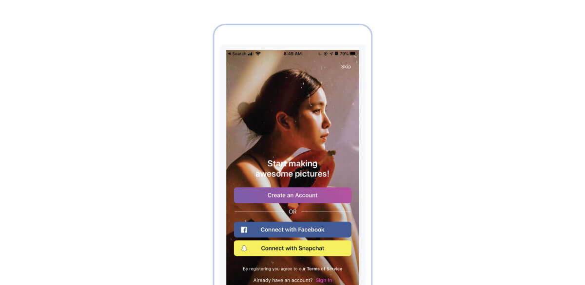
a) Your start screen should talk about the app’s value proposition. For example, PicsArt’s first page tells the users what benefits the app brings to them and why they downloaded it in the first place. So have one captivating line on your sign-up page and impress your audience!
|
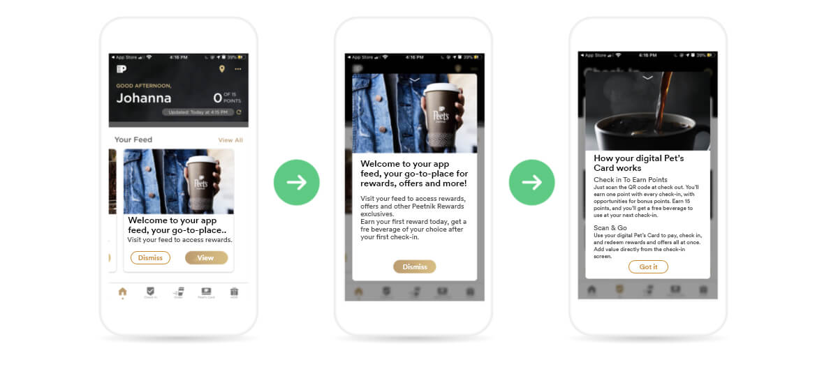
b) Focus on the key features: If you have a multifunctional app, don’t try to put it all out when the user first launches it. Focus on your core features first, the most important ones that will let you accomplish your immediate goals. Then, keep the extra features for different sections of the app. Let the users get to know them while exploring the app. For example, Peet’s app explains how it works and its core functionality through onboarding. The app has many features, but it showcases the most attention-grabbing one and calls out the following action the user should take.
|
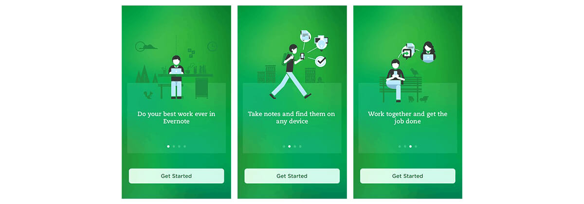
c) Ending it right: If you are using a progress bar on your onboarding page, the last screen should consist of a call to action. It should be pretty simple and user engagement-focused something like this:
Source: Evernote |
2. It should not be a task to sign-in
While all we are focusing on is keeping users signed in, it makes sense to make it easy for them in the first place. Give users the option to sign up with Facebook, Google, etc., making it easy for them to log in. It is a great idea to allow users to explore the actual value of your app as a guest without going through the whole sign-up procedure. Let your potential customers use your app and demand authentication when necessary.
Expect users to abandon your app if there are many fields to be filled with personal information. Start by asking the bare minimum and add on later if necessary. Here’s what you can do:

Source: Apptimize.com |
Also, if you require access to personal data, ask for permissions. Please make your requests comprehensive so that the user knows the intent behind them.
| Pro Tip: Only ask for permission when the user requires a particular feature. For example, ask to access the media only when the user is trying to upload a picture. |
3. Push or not to push
In the 60 apps installed every month, you would be quickly forgotten and dumped if your app is silent for a long time. It would help if you used relevant push notifications to draw users back to the app. More than 50% of users are irritated by notifications. But individualizing your push marketing can make it a lot better. First things first: Don’t spam. Make your notifications relevant, target platforms, users, and devices. Let’s walk through some examples of this ‘not so shiny’ but effective engagement strategy.
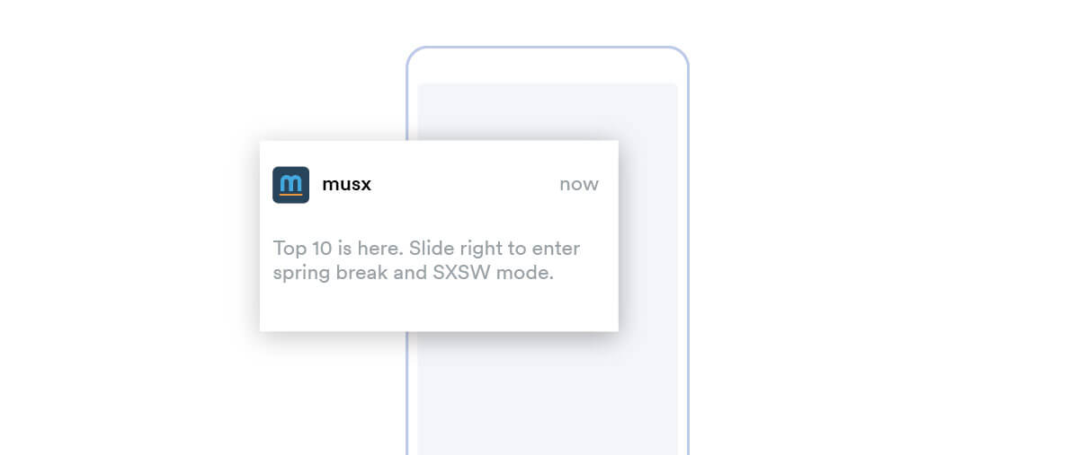
a) Timed notifications: Just like Spotify, MUSX also has a weekly push notification that encourages users to dive into the week’s top songs.
|
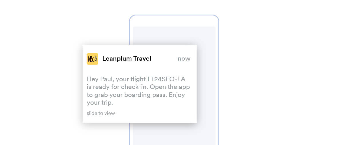
b) Personalised notifications: Do you know 72% of customers engage with marketing messages customized according to their interests? Tailor your push notifications based on user data, interests, and behavior. Here is an example where the notification is personalized, has a clear call to action, and add value:
|
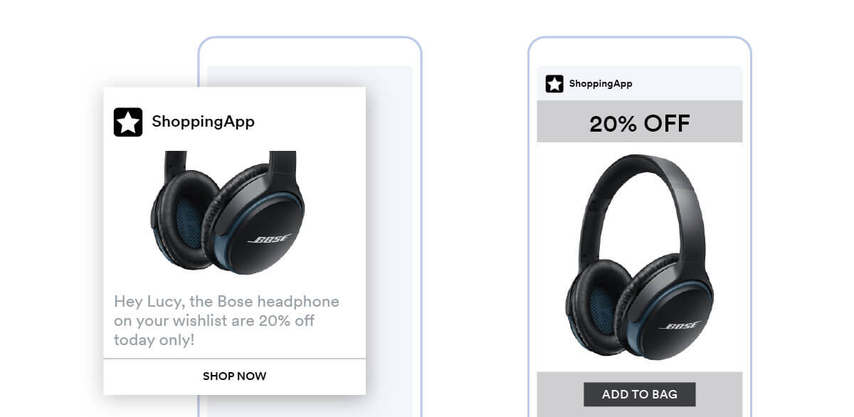
c) Reminder notifications: If a user has left items in the cart, send them a push about their potential purchase and encourage them to check out. Don’t forget to highlight what offer they are going to miss otherwise. If possible, deep-link to take users exactly where they want to go. This is what we suggest:
|
Customize your notifications according to the goals. For example, if your app tracks daily success, send “You achieved your goal yesterday. Keep it up!”. Determine the exact period of inactivity and send reminders to users who haven’t made a conversion.
4. In-app messages go a long way
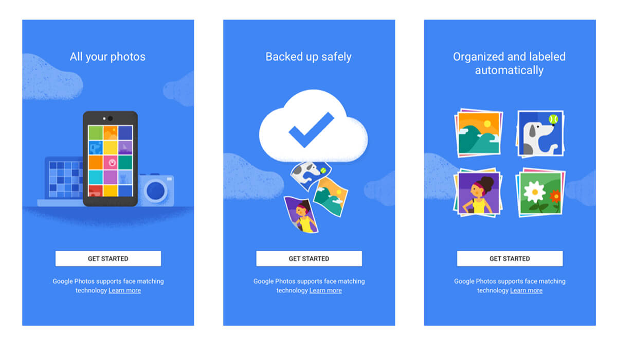
You might be wondering why there is a need for in-app messages when there are push notifications. Well, notifications are displayed on the home screen, not inside the app. Statistics show that in-app messages have a 3.5 times higher retention rate and grant 27% more launches. The message triggered by specific events is meant to give four times better results. Make your in-app messages feel a part of the app and not a marketing attempt. For example, use them in the onboarding process such that when a user explores a new feature, they get a pop-up explaining it. Google photos do this with finesse:
|
Use your in-app messages to update the users about new features and invite them to try out, i.e., increasing engagement time. Another way to make it feel organic is to segment the users based on interests, gender, behavior, and age to tailor-make the messaging to their preferences.
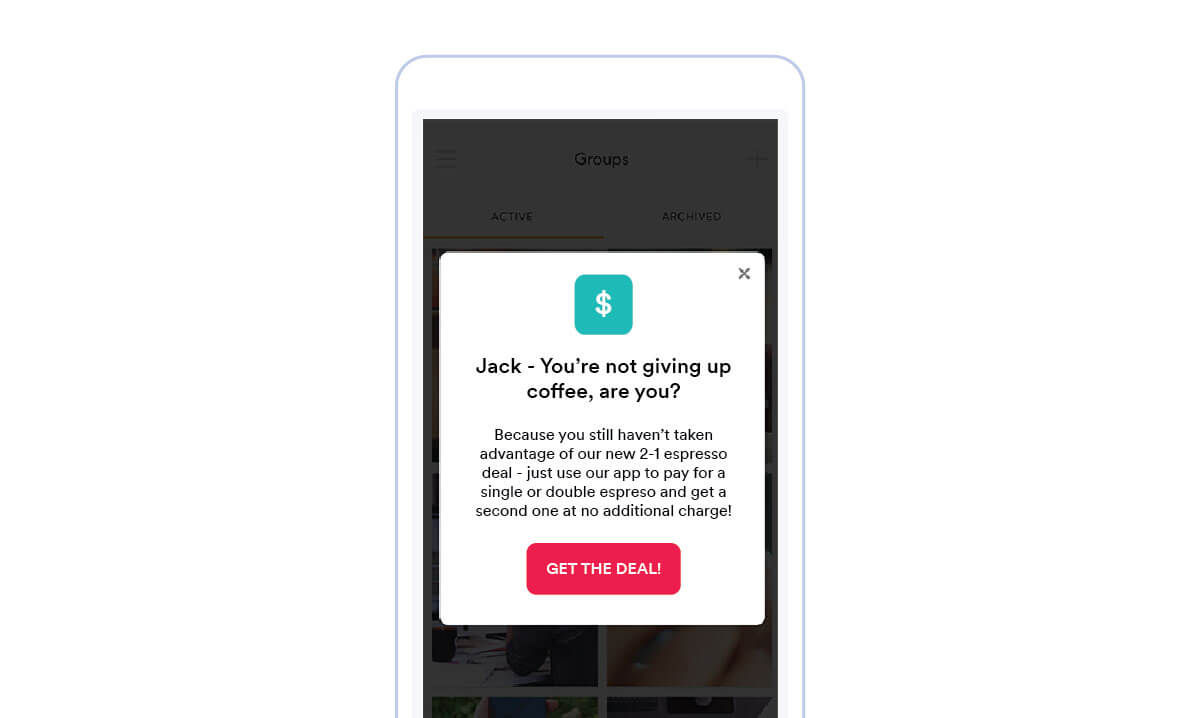
In-app messages are very effective in promoting a deal and showcasing the app’s value. Here’s an example:
 |
5. It’s all about keeping users happy
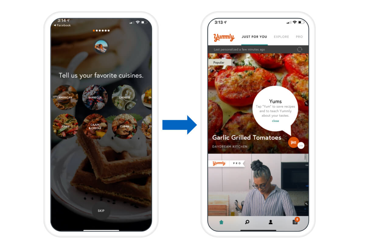
It has been observed that 91% of customers like to buy from a brand that gives them relevant and specific offers. Creating customized and personalized content and giving users the content that matters most to them is a proven way of increasing engagement and conversions. Ask customer preferences during onboarding and recommend to them similar things they have purchased or viewed. Also, give them the option to hide a particular listing if they are not interested. Personalizing recommendations is very fruitful. Spotify uses it, and so do many E-commerce websites. This is how it looks:
|
By collecting vital information on restrictions and preferences during onboarding, you can curate content for the user and provide personalized recommendations. Result? Happy users who are likely to come back.
Evolve Continuously and Focus on the Quality
In a nutshell, it’s all about creating an experience. You now must have a clear understanding of how to boost your app’s engagement. But before you get inspired by app leaders and make yourself a template-winner app, ensure that it is high quality because no hacks can save you if you have a slow, bug-ridden application. So, have an app that is worthy of engagement. Irrespective of the purpose, make your app social media friendly and often update based on feedback.
| Pro Tip: Run A/B tests for your marketing! |
Always test every change such as emojis, personal offers, rich notifications, deep links, media, and in-app events, on a control group of app users.
Learn more about the emerging customer engagement trends in 2022 here.
If you are a retail business owner, you have to know the customer engagement trends rocking the industry.

