- Who are your loyal customers?
- Which are the customers who are most likely to churn?
- Which customers are purchasing the most on your platform?
- Which are the customers who can be turned into the best customers with little effort?
- Which customers are most likely to engage with your campaigns?
RFM Segments Overview
What is RFM Analysis
RFM analysis is a customer behavior segmentation method that uses customers’ past interactions such as a visit to the platform or purchase of an item and based on these interactions divides customers into different RFM groups.The Factors for RFM Analysis
The primary factors are R, F, and M for this model, which are explained below-R is RECENCY - Time since the last visit to the app/site or time since the last purchase.
F is FREQUENCY - The total number of times a user has visited the app/site or the total number of purchases
M is MONETARY - Total money spent by a user or total time spent watching content
How RFM is calculated
Value for Recency, Frequency, and Monetary
Value for Recency, Frequency, and Monetary is the exact value for a specific user, for example, the recency value is 3 days ago, the frequency value is 5 times, and the purchase value is $1523.Scores for Recency, Frequency, and Monetary
MoEngage gives each user a Recency score, a Frequency score, and a Monetary score. Each score runs from 1 (low) to 3 (high). A score is a percentile rank. It places the user in one of three groups based on where their value sits relative to the other users in the analysis. It is not a fixed threshold, so the same value can earn a different score in a different analysis. For Recency, a more recent last event earns a higher score. The three scores together form the user’s combination, written as (R, F, M). For example, (3,3,3) means the top score on all three. Here is an example with three users:
With only three users, each user lands in a different group. In a real analysis, many users share each group.
The segment comes from the combination, not from an average of the three scores. For example, (3,3,1) and (2,2,3) both average 2.33, but (3,3,1) is Price Sensitive and (2,2,3) is Potential Loyalist.
M Value and M Score
The M score and the M value are different things. The M score (1 to 3) ranks a user’s monetary value against other users. The M value shown for a segment is the average monetary value per user in that segment: the sum of the monetary values of all users in the segment, divided by the number of users in it. For example, suppose three users in a segment have total prices of 100, 150, and 200 for the selected monetary event. The segment’s M value is (100 + 150 + 200) / 3 = 150. Two segments can have the same M score and different M values. The M score only says which spending group users fall into. The M value is the average spend of the users in that particular segment, and segments with different Recency and Frequency combinations contain different users. The M value also changes with the date range, because scores are ranked against the users active in that period. A Behavior analysis on the same attribute will not reproduce this number. It averages across all users, or across whichever filter you apply, and not only the users who belong to that RFM segment at the time of analysis.Segment Buckets for RFM Score
Users who show similar behavior on their R, F, and M scores are grouped into the same RFM bucket, or segment. The segment a user lands in comes from their score combination, not from an average of the three scores. MoEngage has two RFM models, and each has its own set of segments. The default RFM model uses all three scores and has 10 segments. The RF model uses only Recency and Frequency and has 8 segments.Engagement Strategies for RFM Segments
The RFM segment predicts user behavior and accordingly, marketers can take action to make the best of these user segments. Here are some basic strategies to be used for different RFM Segments:
Let’s see how it works on the MoEngage dashboard:
RFM Events
By default App/Site Open is selected as Recency event, Frequency event is selected as ‘Same as Recency Event’. Monetary event & Revenu Attribute is default set to the Conversion Goal Event and Revenu Attribute defined in MoEngage Dashboard > Settings > APP > General. Users can change these Recency, Frequency, and Monetary events and apply desired filters for the selected events. This helps run RFM analysis on a specific category, specific business unit, product, or service. Accounts do have an identifier (event property) for different currencies. This identifier has to be used to filter the monetary events. Needless to say, Recency and frequency events should also be of that specific market or category, or business unit for which the monetary event is being analyzed.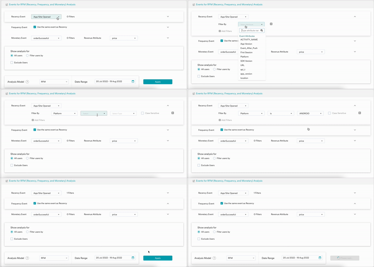
RFM Model & Duration of Analysis
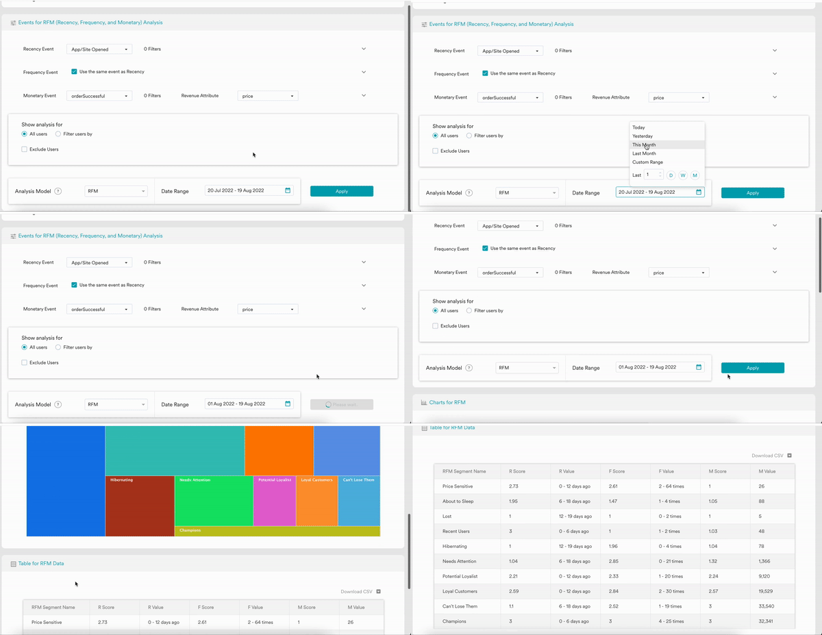
MoEngage dashboard provided RF (Recency & Frequency), RM (Recency & Monetary), and FM (Frequency & Monetary) analysis model other than the default RFM model. Users can select a desired time duration for the RFM model analysis. The recommended analysis period is 30 days - the more the data the better. Individual users can decide the RFM model analysis duration based on their customer acquisition, activation, and retention period. RFM duration should cover all of these customer lifecycle phases if possible. In the case of retail & e-commerce, 3 month time period is an industry-standard for RFM model analysis.RFM analysis can be performed on all data that is present in MoEngage Analytics. In most cases, the data retention is 1 year or 2 years.
Understanding Charts & Tables
RFM Models
The chart represents the different RFM segments, their respective user count, and segment size as a percentage of total users in the selected time duration. The size of the segment on the chart is proportional to the user count. Hover over a segment to see its Recency, Frequency, and Monetary scores and values. For Recency and Frequency, the value in parentheses is the range (low - high) across users in the segment. For Monetary, it is the average monetary value per user in the segment, not a range. Each score in the tooltip is the average of the individual scores of users in the segment, so it can be a decimal, such as 2.68. Chart images can be downloaded in png format for further use.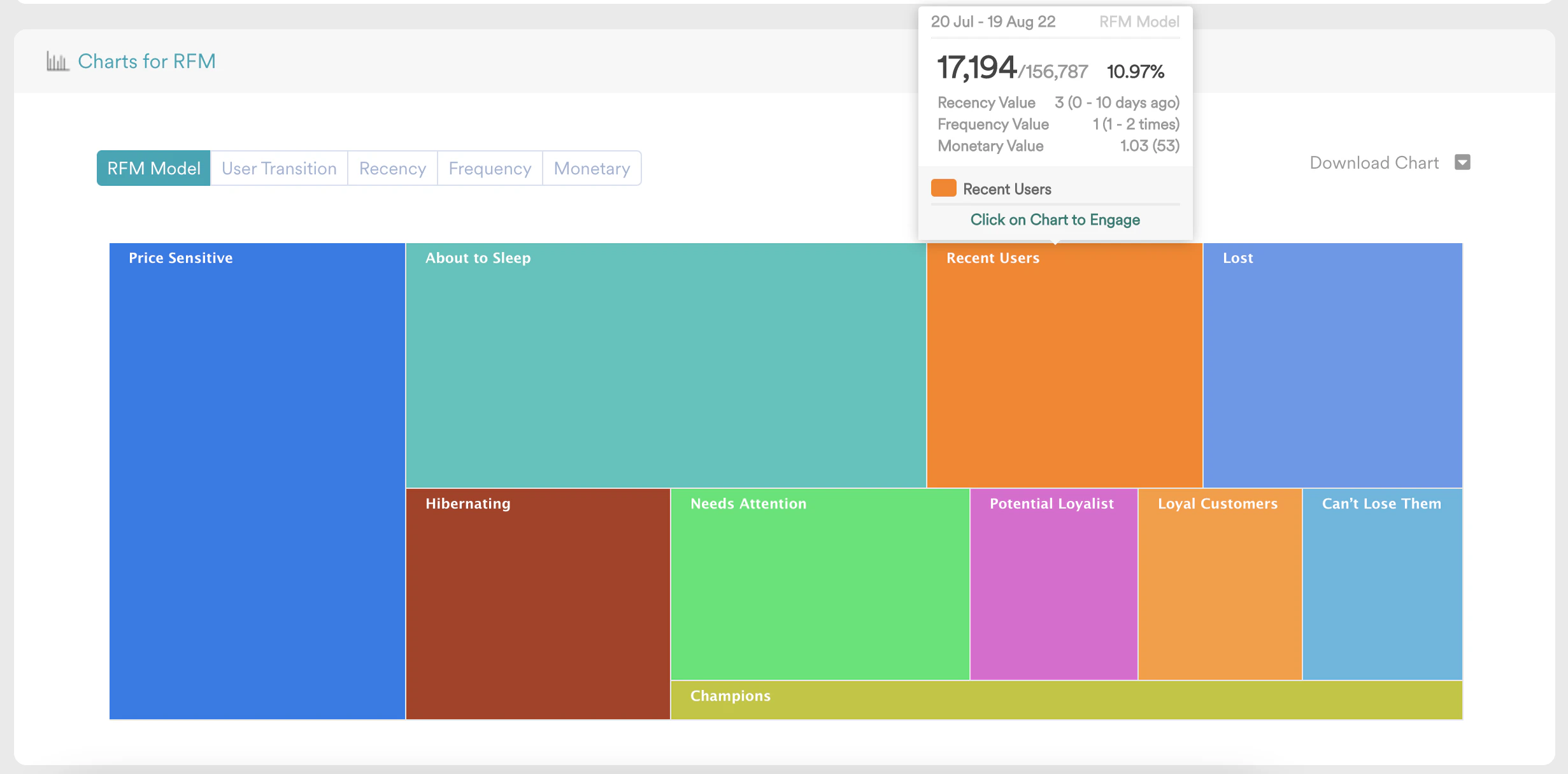
RFM Table
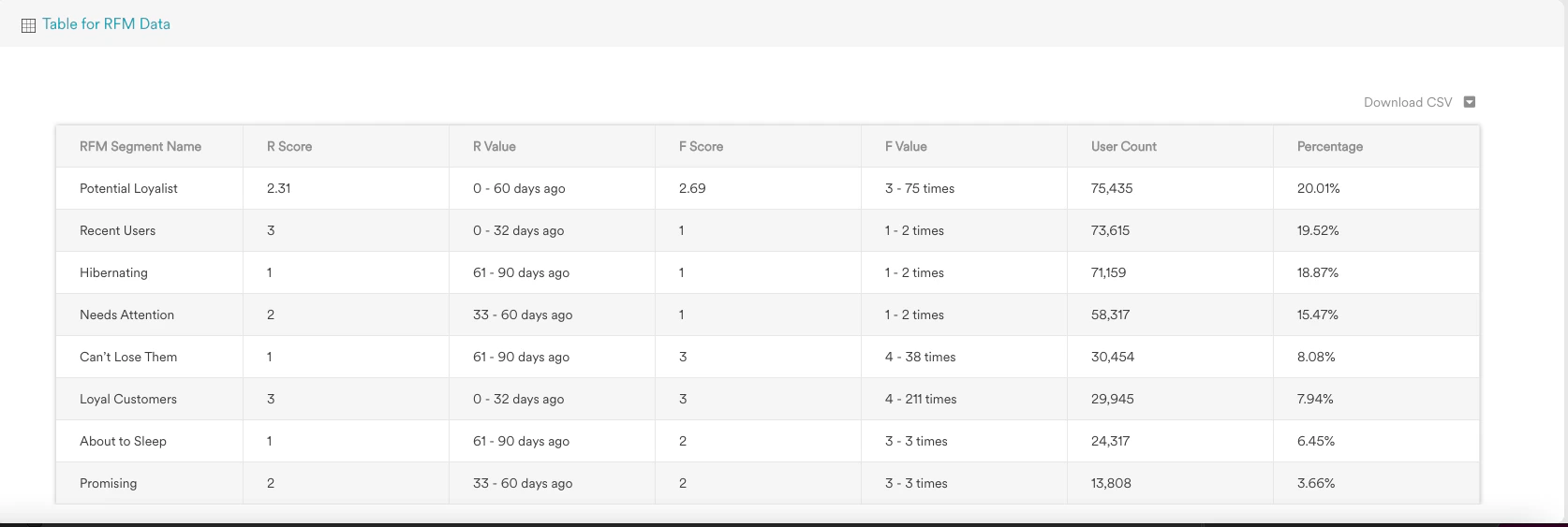
The table represents the same data shown in the chart, in tabular format. the table shows the RFM Segment Name, Recency Score, Recency Value Range, Frequency Score, Frequency Value Range, Monetary Score, Monetary Value Range, User Count, and Percentage of Users. Table data can be downloaded in CSV format for any further use.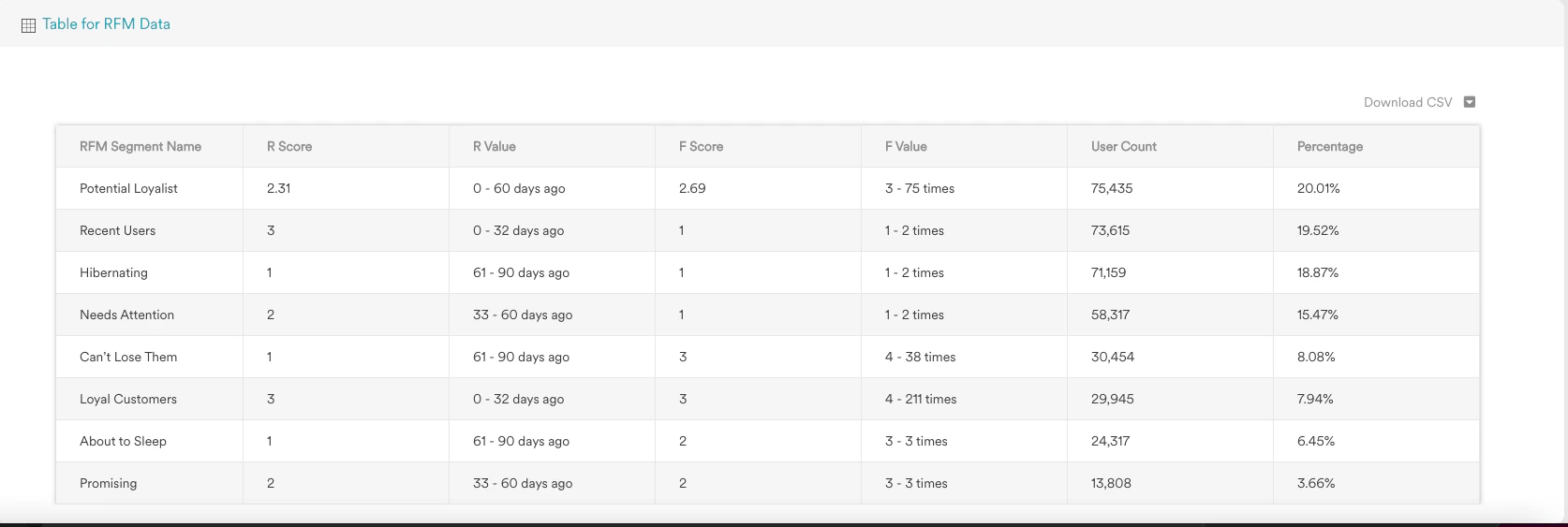
Counts for the same time frame can change slightly between runs. A user near the boundary between two score groups can land in a different group when the analysis runs again, and new data arriving between runs can also move users. This applies to every segment. It is most visible in Lost, About to Sleep, and Hibernating, because their definitions are close.
RFM Transition
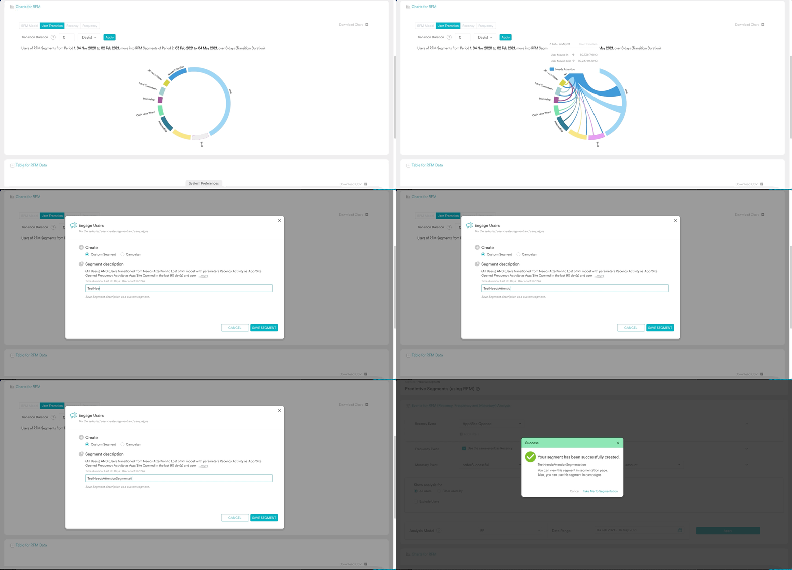
RFM transition represents the count of users, of RFM Segments from Period 1, moving into RFM Segments of Period 2, over the Transition Duration. Transition Duration is the time period over which users migrate from one RFM segment to another RFM segment. The time duration of the origin RFM & destination RFM remains the same. Period 2 is what users select on the Date Range field, let’s say it is x days. Hence Period 1 will also be x days. The chronology here is - Period 1: Transition Duration: Period 2.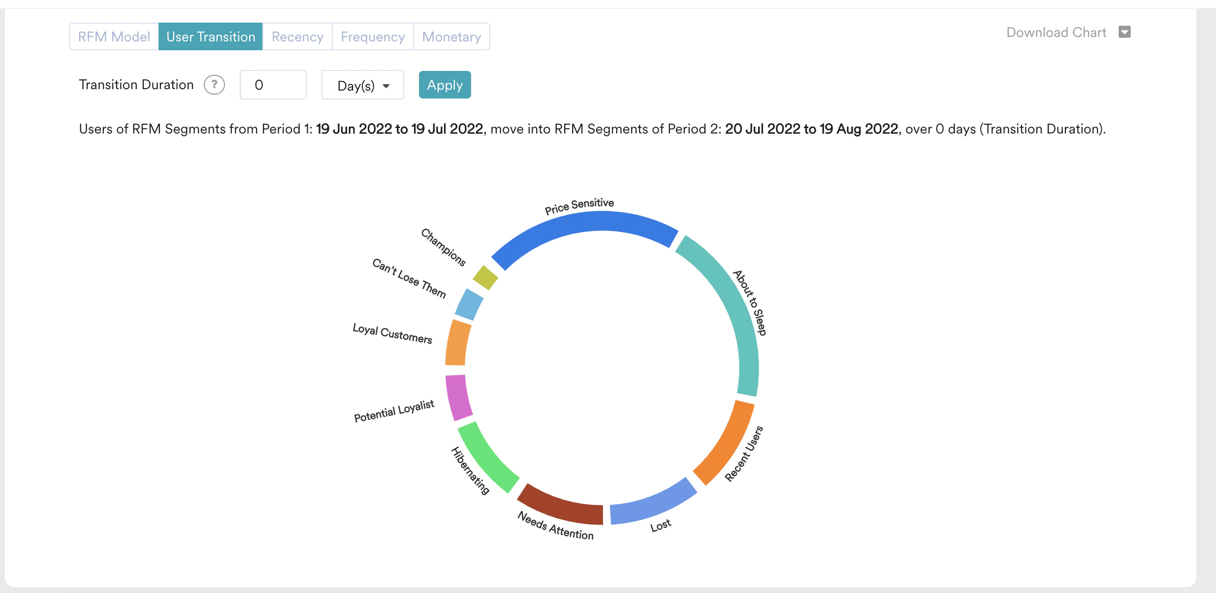
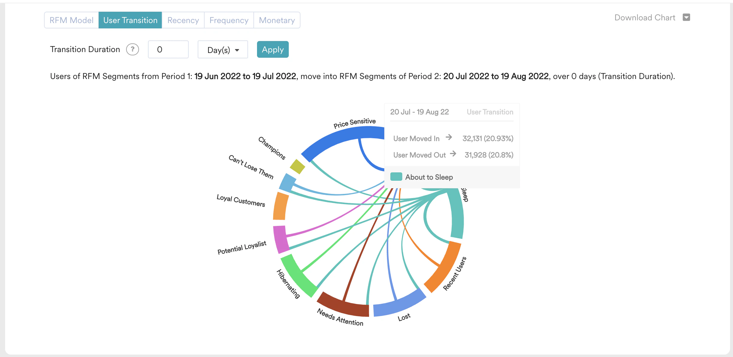
a. Total number is users who got into that segment and number of moved-in users as a percentage of overall user migration.
b. Total number of users moved out of that segment and number of moved-out users as a percentage of overall user migration.
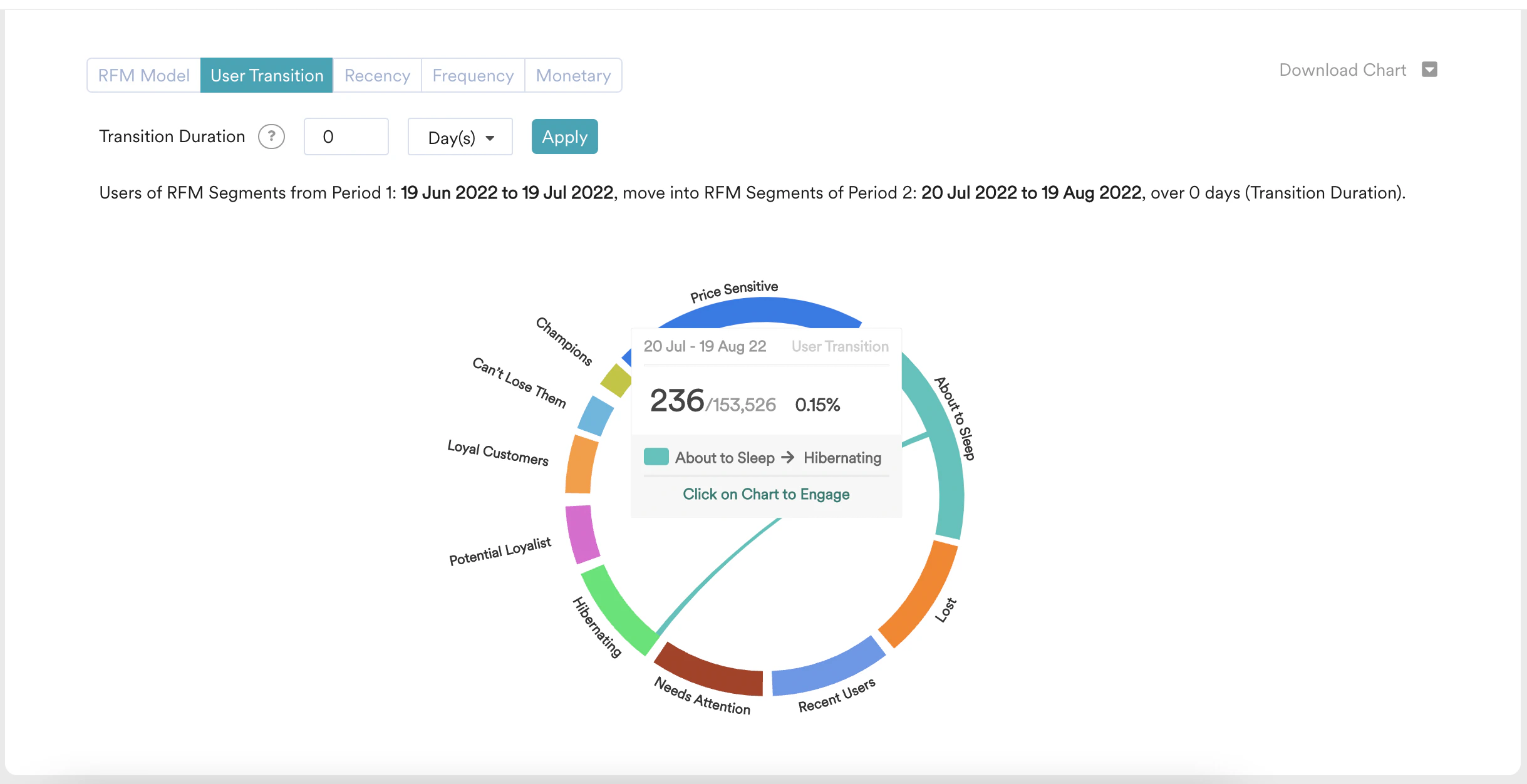
a. Total number is users moved from a specific segment of period 1 RFM to a specific segment of period 2 RFM.
b. It also displays the number of moved-out users as a percentage of overall user migration.
their respective user migration count, and percentage with respect to overall user migration.
Why Model and Transition Counts Differ
RFM scores are relative rankings, so the size of a segment depends on which users are in the analysis. The RFM Model ranks the users active in the date range you select. RFM Transition ranks users across Period 1 and Period 2 together. Because the two reports rank different sets of users, the same segment can show different counts for the same period. For example, the number of Champions in the RFM Model can be much smaller than the number of users who move from Champions to Champions in Transition. Neither number is wrong. Compare counts within one report, and don’t compare a Model count directly with a Transition count.Actionable Analytics on RFM
Users are able to create a custom segment or a campaign from RFM Chart or User Transition chart. Clicking on the chart area of the RFM segment or User Transition chord shows a popup, which let the user create a custom segment or campaign.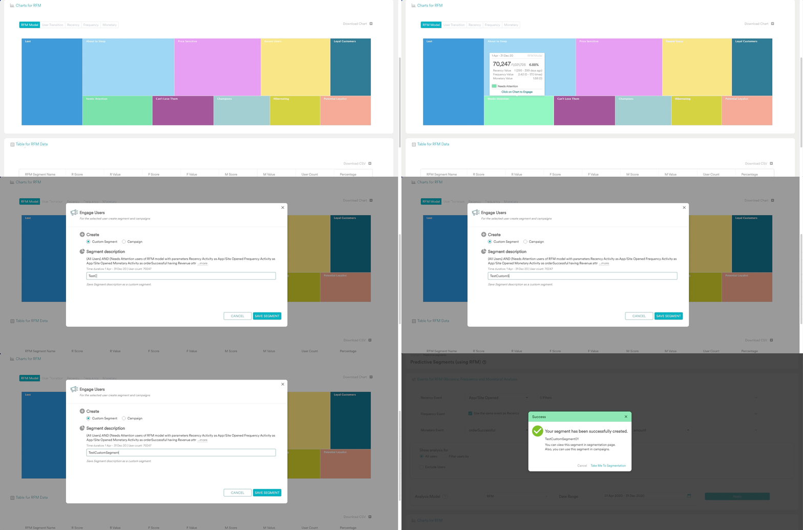
RFM Distribution
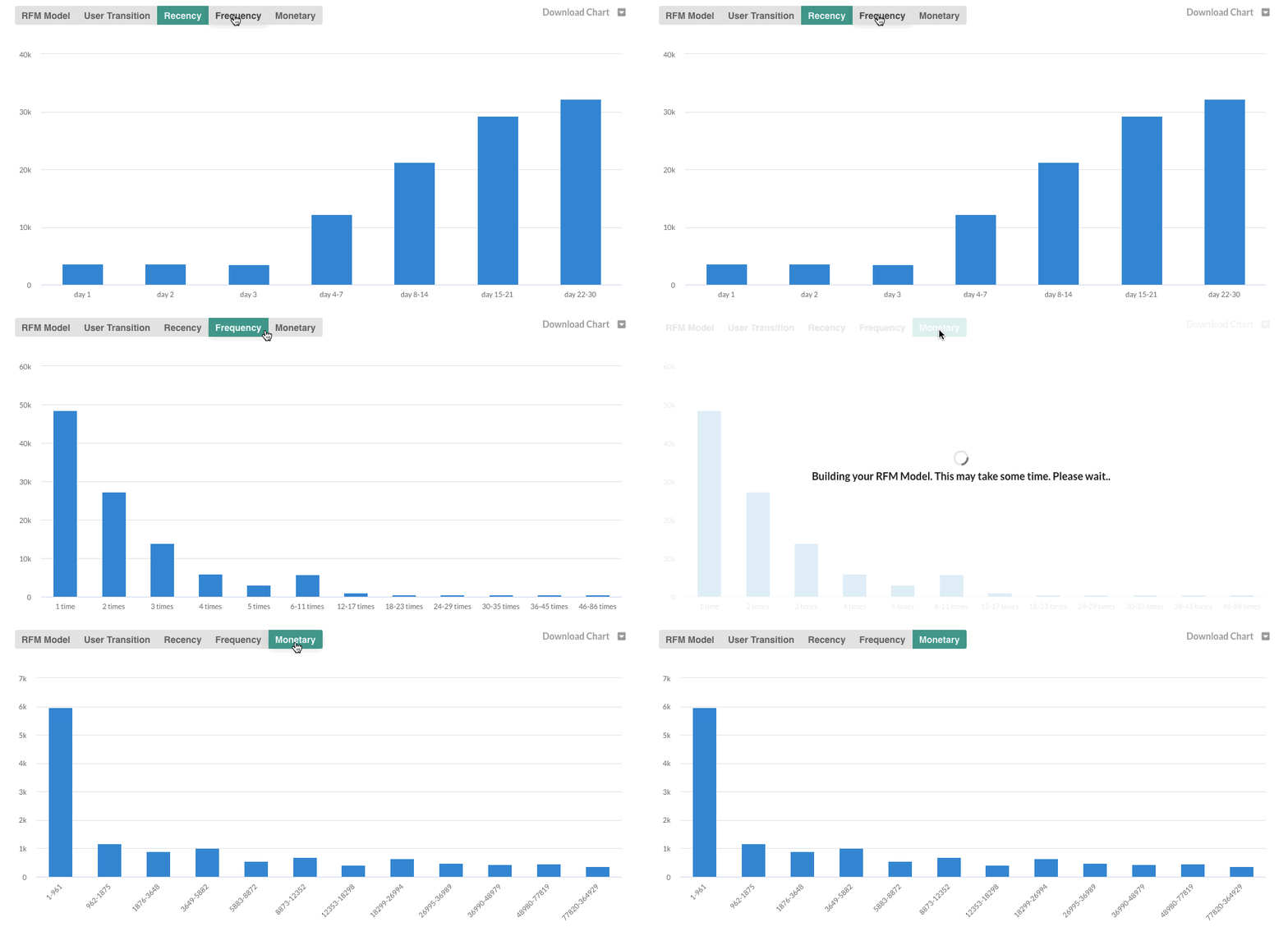
RFM Distribution charts show the distribution of users on Recency, Frequency, and Monetary parameters. Recency Distribution is a distribution of time, from the last visit to the app or time since the last purchase. Frequency Distribution is a distribution of the number of times, users have visited the app or users made purchases. Monetary Distribution is a distribution of revenue generated by reach users.