

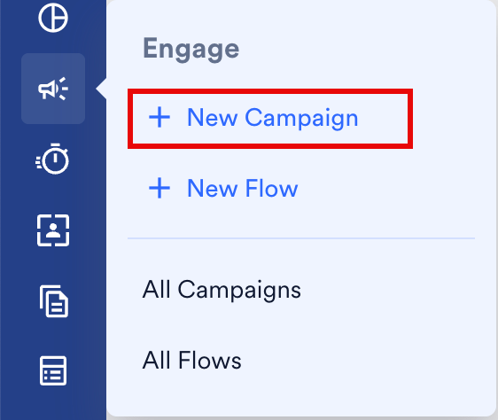
- On the sidebar in the MoEngage dashboard, hover over Engage. The Engage menu appears.
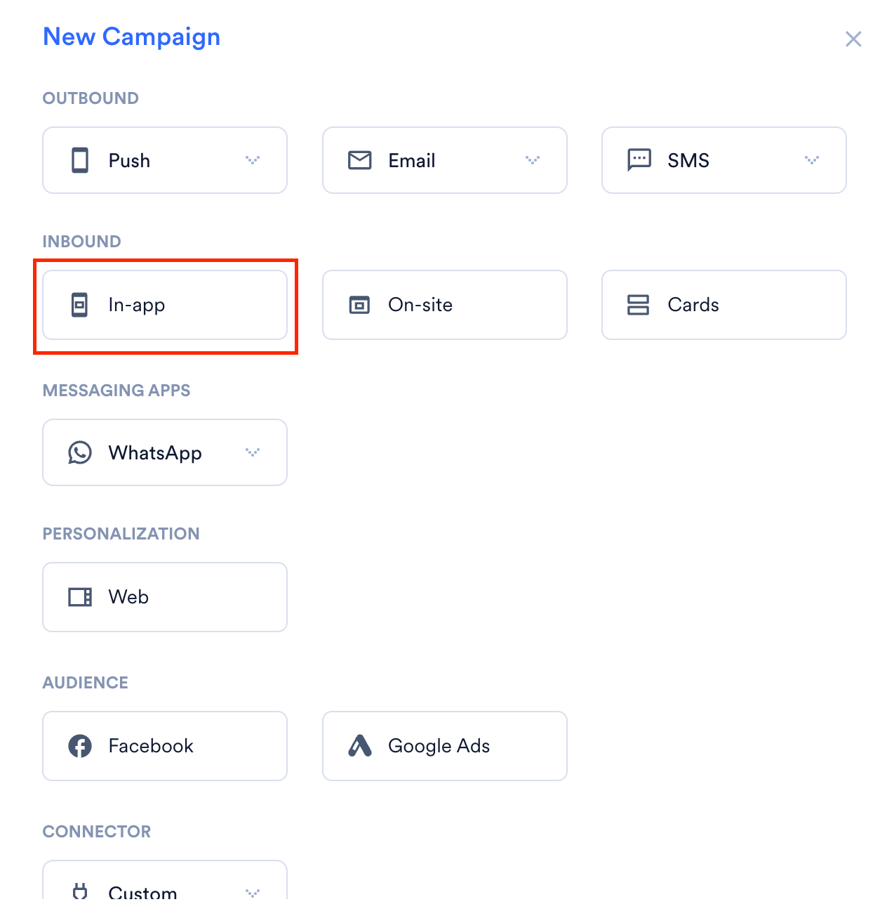
- Click + New Campaign. The New Campaign dialog box appears. You can also click All Campaigns on the Engage menu and then click + Create campaign on the All campaigns page.
- Under Inbound, click In-app. The In-App campaign creation page appears.
Create an In-App Message Campaign
To create an In-App message campaign, follow these steps:- Target users: Define the audience for your campaign.
- Content: Design the message content.
- Schedule and goals: Set the delivery schedule and track campaign performance.
Step 1: Target Users
Campaign Details
The Campaign Details section includes: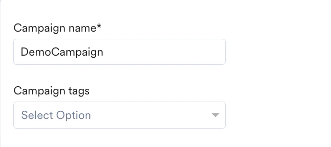
- Campaign name: Enter a name to easily identify and manage your campaign. The campaign name must be between 5 and 256 characters.
- Campaign tags: Select up to five tags from the drop-down list. Tags help you organize and filter campaigns. For more information, refer to Campaign Tags.
Select Platform
In the Target platforms section, select the required platforms where your In-App message should display.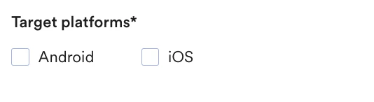
If Portfolio is enabled, you can select target projects from the Select Project dropdown to specify the website where your campaign will be delivered. For more info, refer to Portfolio for In-App Campaigns.
Trigger Criteria
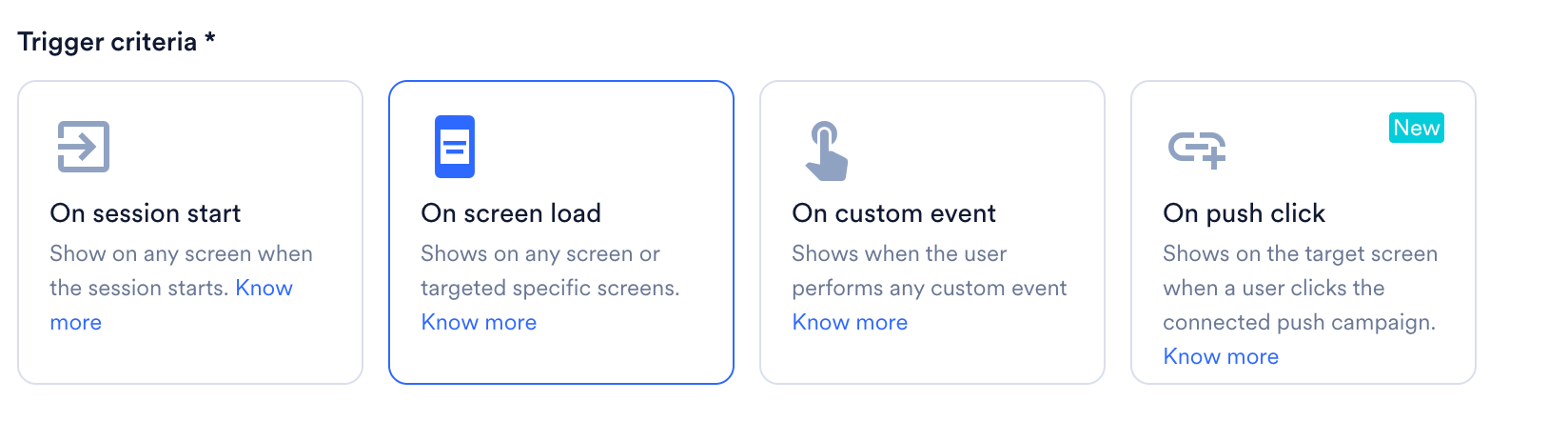
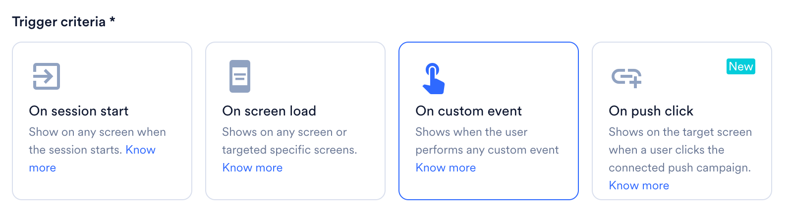
This section defines when the In-App message triggers for users.- On session start
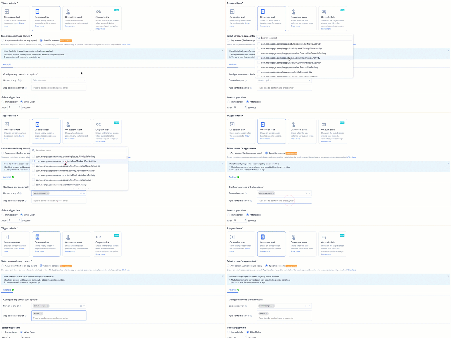
- On screen load
- On custom event
- On push click
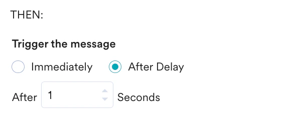
Select On session start to display the In-App message as soon as a user’s app session begins. An app session starts when the user first interacts with the app. The session ends if the user logs out, enters from another traffic source, or is inactive for longer than the defined inactivity period (default is 30 minutes).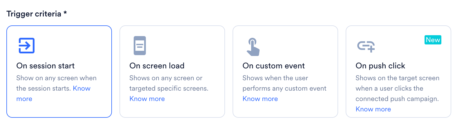
- Make sure to add a delay so the In-App message does not appear on the splash screen.
- With the After Delay option, you can set a maximum delay of one day (86400 seconds) and a minimum delay of one second.
- The After Delay option is available in the following SDKs:
- Android SDK version 6.9.0 or later
- iOS SDK 4.11.1 or later
- React Native SDK 8.6.0 or later
- Cordova SDK 8.4.0 or later
- Capacitor SDK 3.1.0 or later
- This trigger condition is available in the following SDKs:
- Android SDK version 9.0.0 or later
- iOS SDK version 6.06.0 or later
- This trigger condition is presently available only for native Android and iOS. It is not supported for hybrid.

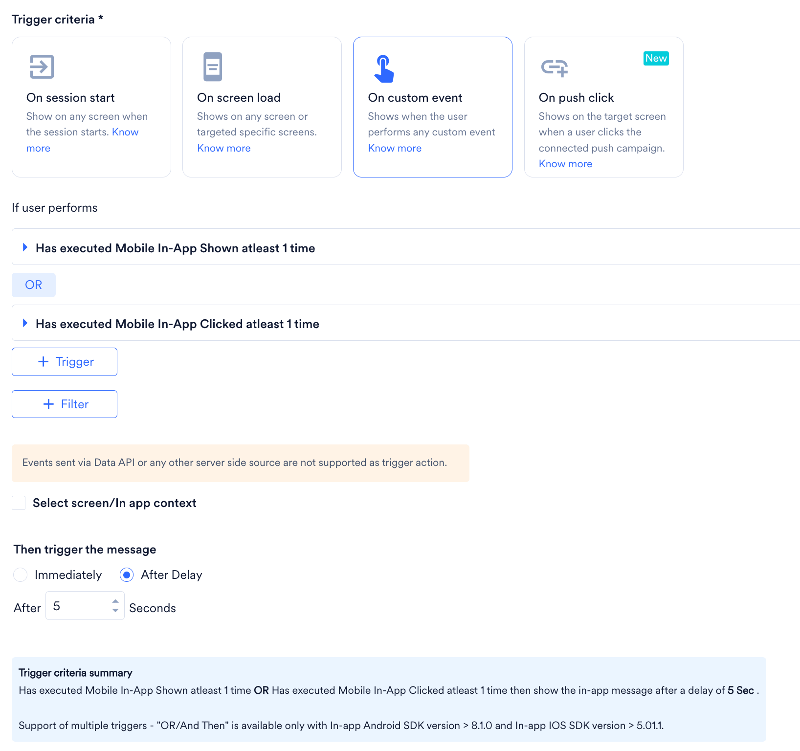
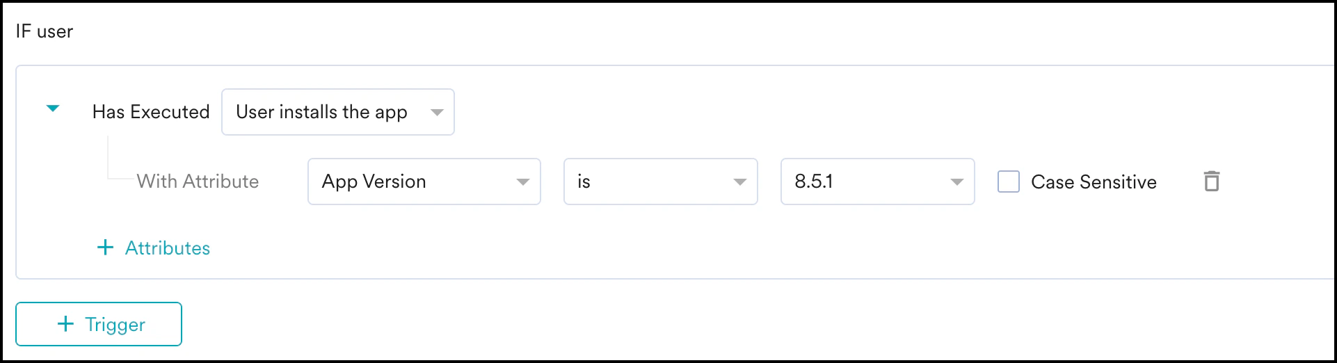
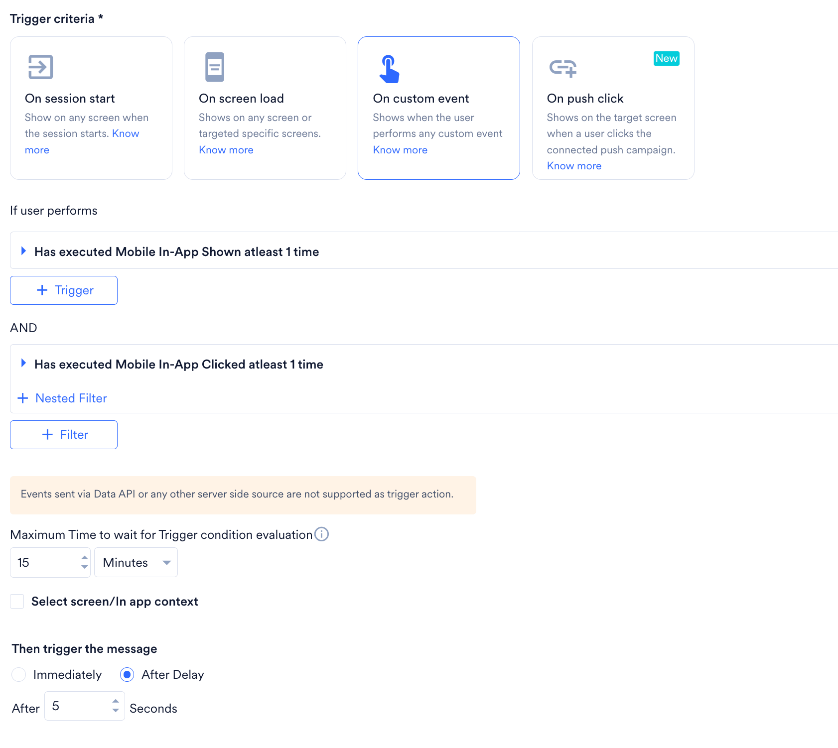

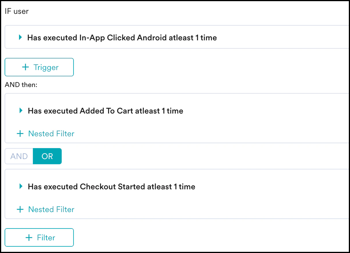

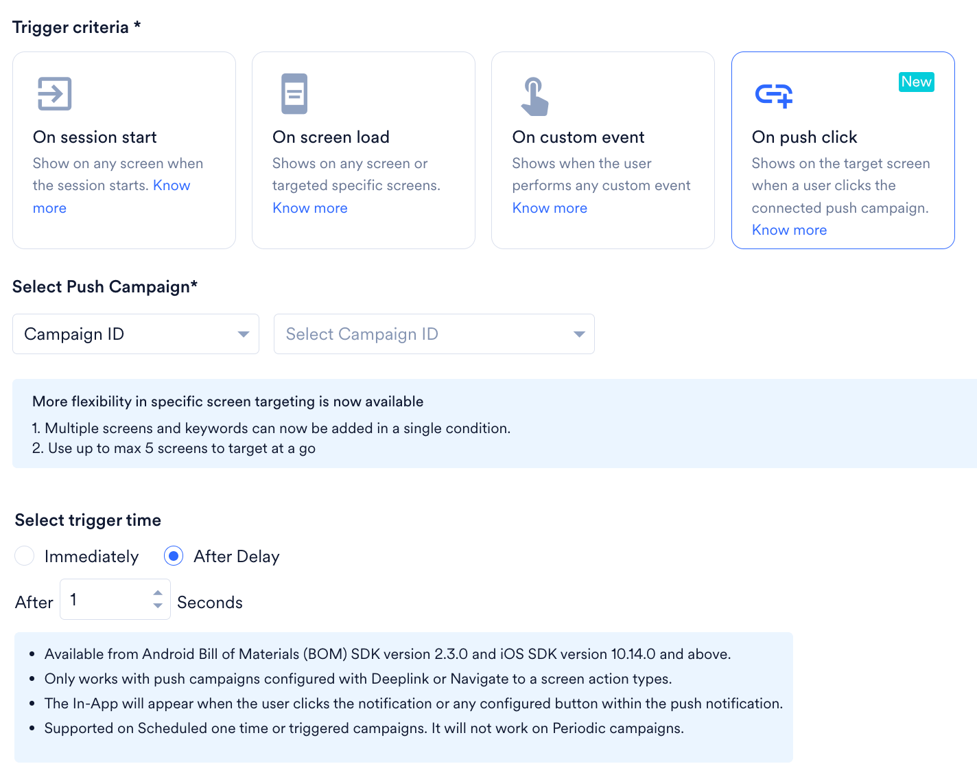
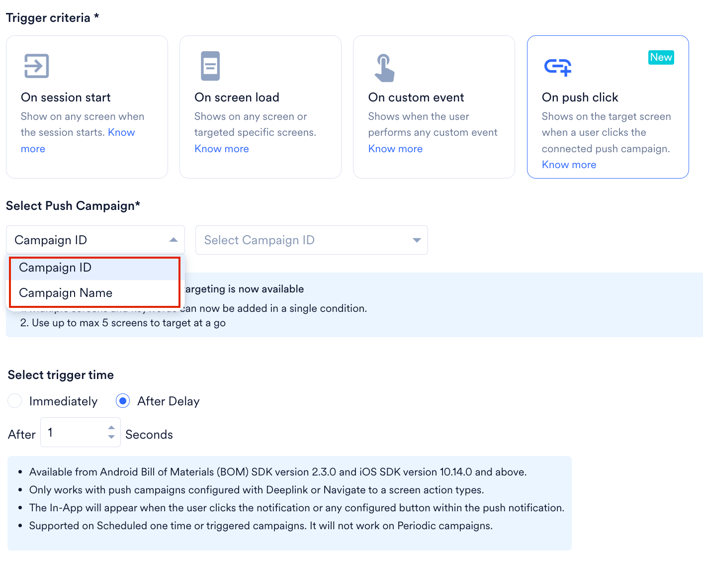
Select Target Audience
This section includes segmentation filters to help you select the target audience for your campaign.- All Users
- Filter by User Property
- Filter by User Behavior
- Filter by User Affinity
- Filter by Custom Segment
Select this filter option to send the campaign to all app users. When you use this option, you cannot add multiple filters.
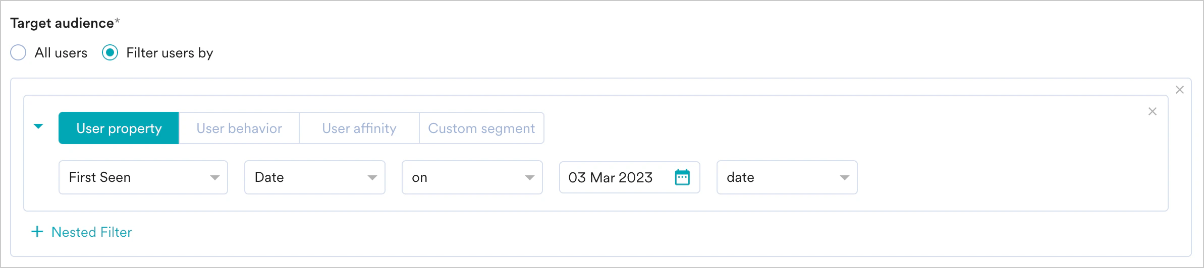
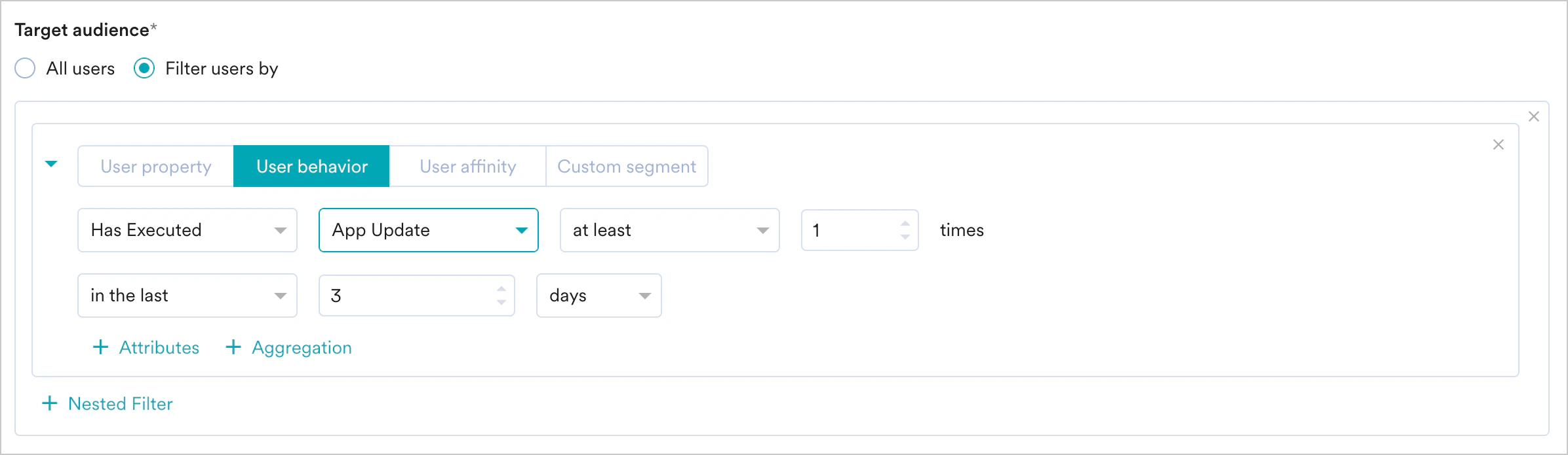
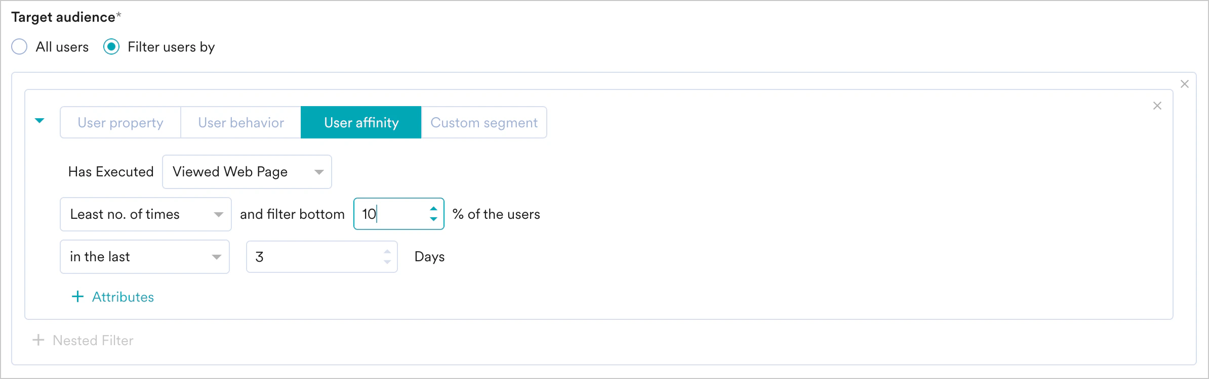
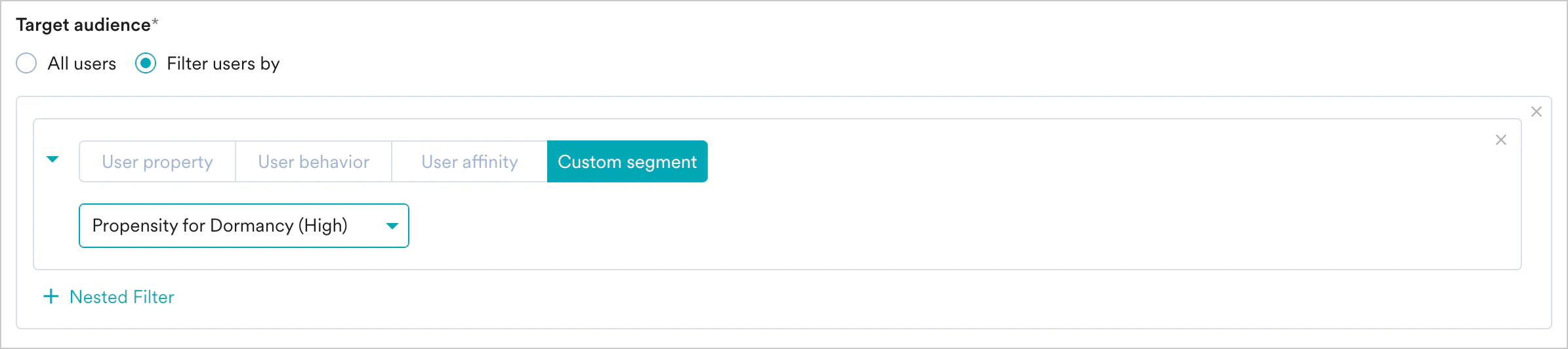
- Create Multiple Filters: Create and combine multiple user property, user activity, and custom segment rules to build complex user segments.
- Click + Filter.
- Click AND or OR.
- Select the attribute or event and define the filter conditions.
- Exclude Users: Select this check box to define filter criteria for users to exclude from the campaign.
- Re-evaluate campaign eligibility before displaying: Turn this toggle on to verify a user’s segment eligibility at the exact moment a campaign is triggered. This prevents users from seeing irrelevant content if their attributes change during an active session. For more information, refer here.
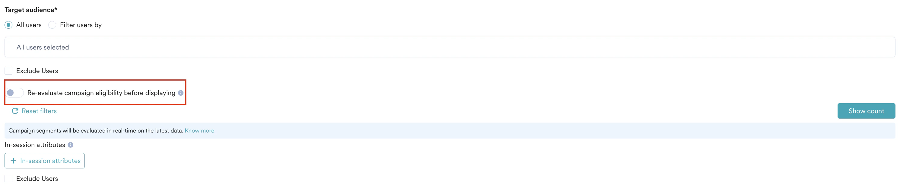
- Reset filters: Click this option to clear all segmentation filters.
- Show count: Click this button to display the total number of users currently in the configured segment.

If you have the Portfolio feature enabled, you can create user segments by combining user data and behavior from different apps and websites (Projects) within your workspace. For more information, refer to Segmentation in a Multi-Project Portfolio.
Re-evaluate Campaign Eligibility
By default, segment membership is evaluated during the initial campaign call when a user opens the app. Any attribute changes occurring mid-session are not reflected until the next app launch. When you enable the Re-evaluate campaign eligibility before displaying toggle, the SDK intercepts the campaign trigger to perform a live check with the backend. If user properties have changed (for example, transitioning from a Free to Paid status), the SDK discards the outdated campaign and fetches content relevant to the user’s updated state. You can enable re-evaluation for a maximum of 5 In-App campaigns at a time.InformationAvailability and Scope
- SDK Version: Support for segment re-evaluation is available starting with In-app Android SDK version 9.7.0 and In-app IOS SDK version 7.04.0.
- Supported segments: This feature is available only for User Property-based segments and Real-Time Segment Evaluation (RTSE) segments.
- Excluded segments: This option is hidden for segment types where real-time changes do not apply (for example, static segments).
- Limit: This option is available for up to five campaigns.
- Trigger detection: The user performs an action that matches the trigger criteria.
- Backend verification: The SDK initiates a backend request for a new evaluation.
- Eligibility check: The backend evaluates the user’s current attributes. If the user is eligible, the campaign appears; if not, it is dropped, and a failure is logged.
- Campaign refresh: If the campaign is dropped, the SDK performs a new campaign call to fetch campaigns relevant to the updated segment.
- Campaign display: The new, eligible campaign displays to the user within the same session on the next trigger.
Note: If you disable this feature, the SDK continues to show Campaign A (Free) even after a user upgrades, until the app is restarted. Additionally, if re-evaluation is not enabled for subsequent campaigns, the SDK will not perform real-time checks for those specific campaigns.
Campaign Audience Limit
This feature helps you control campaign reach and expenditure by limiting the number of users who receive it based on engagement metrics like sends, impressions, and conversions. You can set total, daily, or instance-level limits for campaigns. For more information, refer to Campaign Audience Limit.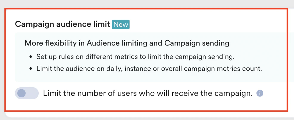
In-session Attributes
In-session attributes enable you to group and target users based on their actions within the current app session. For example, use in-session attributes to display onboarding flows exclusively to new users visiting your app for the first time. This method ensures that these users receive a customized experience immediately during their initial session. To add an in-session attribute:- Click the + In-session attributes button and select the required attribute from the list.
- Use And/Or to combine multiple in-session attributes.
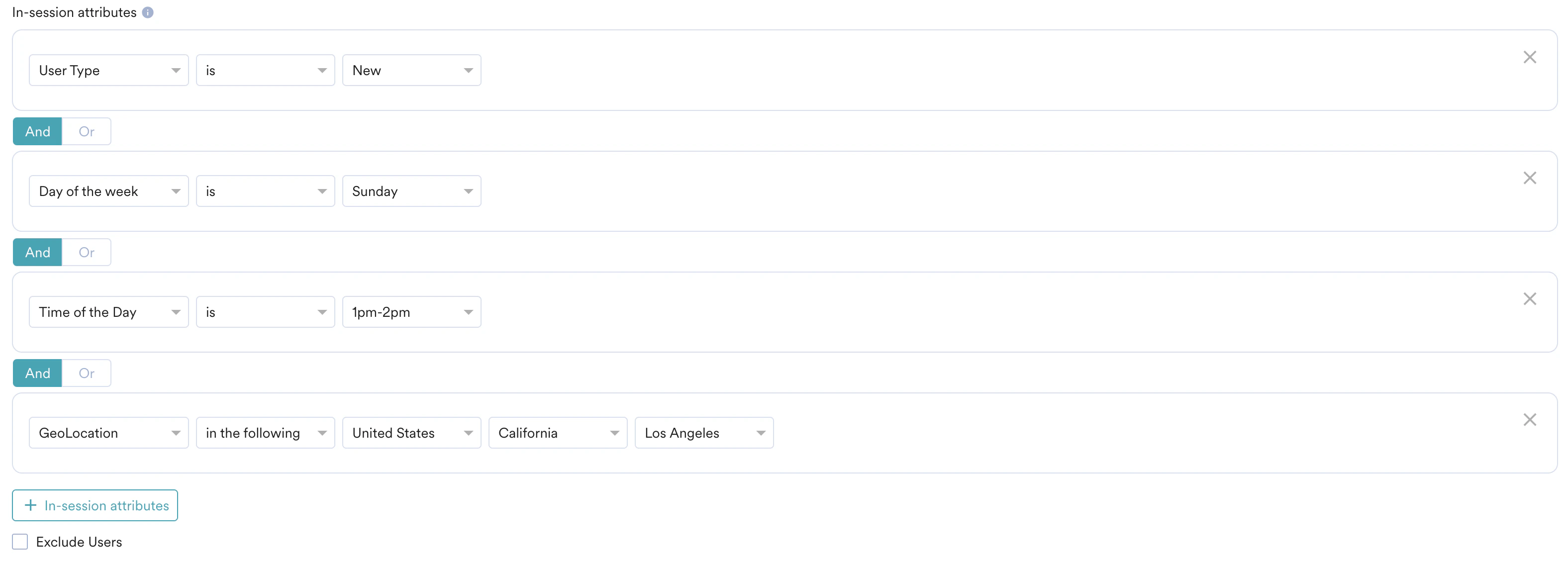
- Select the Exclude Users check box to exclude users based on their in-session activity.
- Query Parameter: This attribute segments users based on query parameters in the Uniform Resource Locator (URL). Typically, users land on your personalized URL by clicking an advertisement on any social media platform.
- You can use UTM parameters to segment users based on their source or the campaign that led them to the URL.
- UTM parameters like utm_source identify campaigns driving users to websites. You can use UTM and custom parameters to segment users and personalize their experience.
- User Type: This attribute segments users based on whether they are new or returning. The SDK stores user details (unique_id) for each user in the app storage. A user is considered a Returning User if the associated user details exist in the SDK data storage. Otherwise, the user is considered New. If the user clears the app cache, they are considered new.
- Note: If two users (User 1 and User 2) use the same device and User 2 logs in after User 1, User 2 is considered a returning user.
- Day of the Week: This attribute segments users based on the day of the week they visit your app.
- Time of the Day: This attribute segments users based on the hour of the day they visit your app. You can choose from any of the one-hour slots available in the list.
- GeoLocation: This attribute segments users based on their geolocation when they visit your app. You can choose the country, state/region, and city where the user is located or exclude a specific country.
Control Group
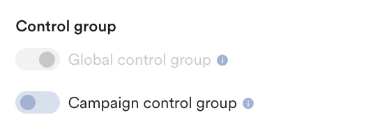
This section provides information about control groups for the campaign. Control Groups are enabled only for promotional campaigns. They are not applicable for transactional campaigns. Enable control groups to which you want to send the promotional campaign. In the Control group section:- Turn the Global control group toggle on to not send the campaign to all users in the control group.
- Turn the Campaign control group toggle on to not send the particular campaign to the control group.
Step 2: Content
The following options are available to add content for your campaign:Prebuilt and Saved Templates
This option enables you to choose a template from the following categories: All (chosen by default), Pre-built, Saved templates, and API templates. In this section, you can perform the following actions:- Search templates: Enter the template name in the Search templates bar.
- Filter templates: Use the following options to filter templates:
-
- Filter By Type: Filter templates based on pre-built types (e.g., Nudges, Carousel, Pop-up).
- Filter By Use Case: Filter templates based on their purpose (e.g., Promotional, Feedback, Survey).
- Filter By Content: Filter templates based on their content (e.g., text-only, buttons).
- Filter By Editor: Filter based on the editor that supports the template (Native, HTML, or Self Handled).
-
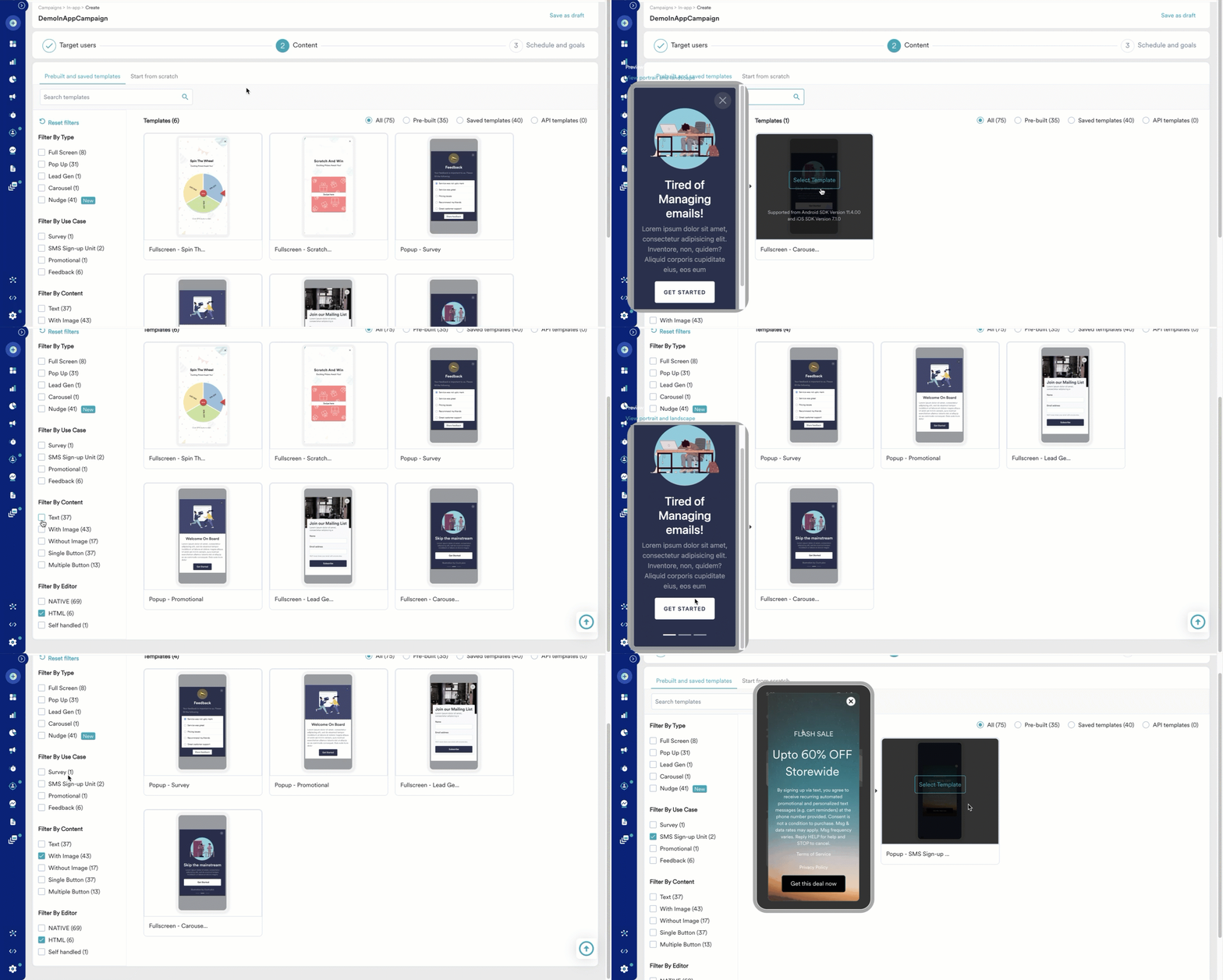
- Pre-Built templates
- Saved templates
Pre-built templates support various options beyond adding text, such as adding links and buttons, displaying ratings, and pop-up templates. The following table summarizes some common pre-built templates:
Start from Scratch
This option enables you to choose from the following content creation methods:- Self Handled: For more information, refer to Self Handled In-App Template.
- Zip upload: For more information, refer to Zip Upload Templates.
- Custom HTML upload: For more information, refer to HTML In-App Templates.
Add Content to the Template
Perform the following steps to add content to the selected template and template type.Common Actions
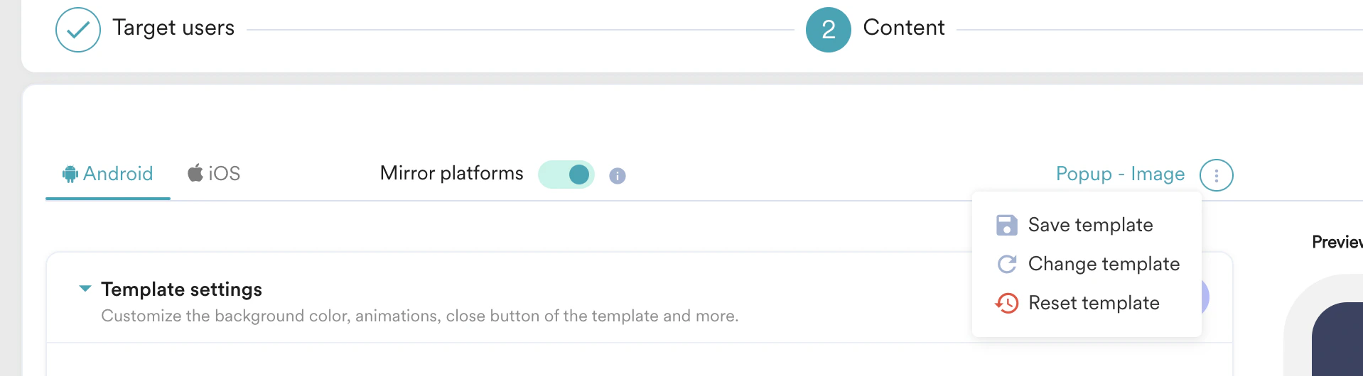
- Turn the Mirror platforms toggle on to use the same template and configure the message together for the selected platforms.
- Click + A/B test to create a variation. You can create a maximum of five variations.
For more information, refer to A/B Testing Overview. - Click + Locales to add a locale. You can add a maximum of 10 locales for a single campaign.
For more information, refer to Using Locales. - Click the icon to:
- Save Template
- Change Template
- Reset Template
Template Settings
Text
| Field | Description and action | ||||||||||||||||||||||||||
|---|---|---|---|---|---|---|---|---|---|---|---|---|---|---|---|---|---|---|---|---|---|---|---|---|---|---|---|
| Heading | Type or paste the heading in the text box. | ||||||||||||||||||||||||||
| Font size | Type or use the up and down arrows to select the font size used in the text. | ||||||||||||||||||||||||||
| Font color | Type the hexadecimal code or select the font color used in the text. | ||||||||||||||||||||||||||
| Custom font | Select the custom font and type the font name used in the text. | ||||||||||||||||||||||||||
| Background color | Select and define the background color of the message. | ||||||||||||||||||||||||||
| Action | Select one of the following from the drop-down list:
| ||||||||||||||||||||||||||
| Width, Margin, and Padding | |||||||||||||||||||||||||||
| Width | Use the slider or type the value to define the width of the text box in percentage. | ||||||||||||||||||||||||||
| Margin | Select Together and use the slider or type the value to define all margins of the text box in pixels. OR Select Separate and use the slider or type the value to define the top, bottom, right, and left margins of the text box in pixels. | ||||||||||||||||||||||||||
| Padding | Select Together and use the slider or type the value to define all padding for the text box in pixels. OR Select Separate and use the slider or type the value to define the top, bottom, right, and left padding of the text box in pixels. | ||||||||||||||||||||||||||
| Border | Select the following:
| ||||||||||||||||||||||||||
Image
Perform one of the following actions:| Field | Description | ||||||||||||||||||||||||||
|---|---|---|---|---|---|---|---|---|---|---|---|---|---|---|---|---|---|---|---|---|---|---|---|---|---|---|---|
| Image URL | Select the Image URL option and enter or paste the URL of the image. | ||||||||||||||||||||||||||
| Upload image | Select the Upload image option and drag and drop the image or click upload from the computer to upload the stored image. Note: • Ensure that the image size is less than 10MB. • Ensure that the aspect ratio of the image is 2:1 (Width x Height). | ||||||||||||||||||||||||||
| Action | Select one of the following from the drop-down list:
|
Buttons
| Field | Description | ||||||||||||||||||||||||||||||
|---|---|---|---|---|---|---|---|---|---|---|---|---|---|---|---|---|---|---|---|---|---|---|---|---|---|---|---|---|---|---|---|
| Button text | Type or paste the text used in the button. | ||||||||||||||||||||||||||||||
| Font size | Type or use the up and down arrows to select the font size used in the button. | ||||||||||||||||||||||||||||||
| Font color | Type the hexadecimal code or select the font color used in the button. | ||||||||||||||||||||||||||||||
| Custom font | Select a custom font and type the font name used in the button. | ||||||||||||||||||||||||||||||
| Background color | Select and define the background color of the button. | ||||||||||||||||||||||||||||||
| Action | Select one of the following from the drop-down list:
| ||||||||||||||||||||||||||||||
| Width, Margin, and Padding | |||||||||||||||||||||||||||||||
| Width | Use the slider or type the value to define the width of the text box in percentage. | ||||||||||||||||||||||||||||||
| Margin | Select Together and use the slider or type the value to define all margins of the text box in pixels. OR Select Separate and use the slider or type the value to define the top, bottom, right, and left margins of the text box in pixels. | ||||||||||||||||||||||||||||||
| Padding | Select Together and use the slider or type the value to define all padding for the text box in pixels. OR Select Separate and use the slider or type the value to define the top, bottom, right, and left padding of the text box in pixels. | ||||||||||||||||||||||||||||||
| Border | Select the following:
| ||||||||||||||||||||||||||||||
Personalize Content
Personalize the content of your In-App campaign by using the ’@’ symbol to insert user properties, user events, product sets, content APIs, and content blocks. This enables dynamic and relevant messages for each user. For more information, refer to:- MoEngage Templating Language (JINJA)
- Derived Events & Attributes
- Content APIs
- Content Block
- Auxiliary Data
- In step 2 of campaign creation, click the text box or the image property URL.
- Type @ to personalize the content.
- Click either Data personalization or Content Block.
- Click the Data personalization tab and from the drop-down, select one of the following:
- User Properties
- Select one of the following as fallback options if personalization does not work:
- No Fallback: No alternate content is provided if personalization fails.
- Do not send In-App: The In-App message is not sent if personalization fails.
- Replace Text: Type or paste the text to use if personalization fails.
- Product Sets
- Content API: Modify the values of the Content API parameters.
- Click Content Block:
- Select the content block to insert.
- Click Insert only the content of the content block.
- Click Done.
Test Campaign (optional)
Test Campaign (optional)
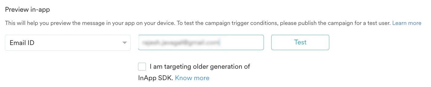
Test campaigns enable you to preview the campaign on a test device to ensure your notification displays as desired.Test the campaign you created by selecting any of the following options and providing the value for the attribute chosen for your test user:
- Unique ID
- Email ID
- Mobile Number (Registered With MoEngage)
- Google Advertising Identifier
- iOS Identifier For Advertising
- Device Push Token
-
Custom Segment
Step 3: Schedule and Goals
This section includes:- Delivery Schedule: Choose when to deliver the campaign to your users and how often.
- Conversion goals: Select the conversion goals and revenue metrics to track for the campaign.
- Delivery controls: Choose advanced delivery options such as throttling, frequency capping, and expiration settings.
Delivery Scheduling
The following delivery schedule options are available for In-App Campaigns:- One Time
- Periodic
Select this option to send the campaign immediately or at a specified time to target users.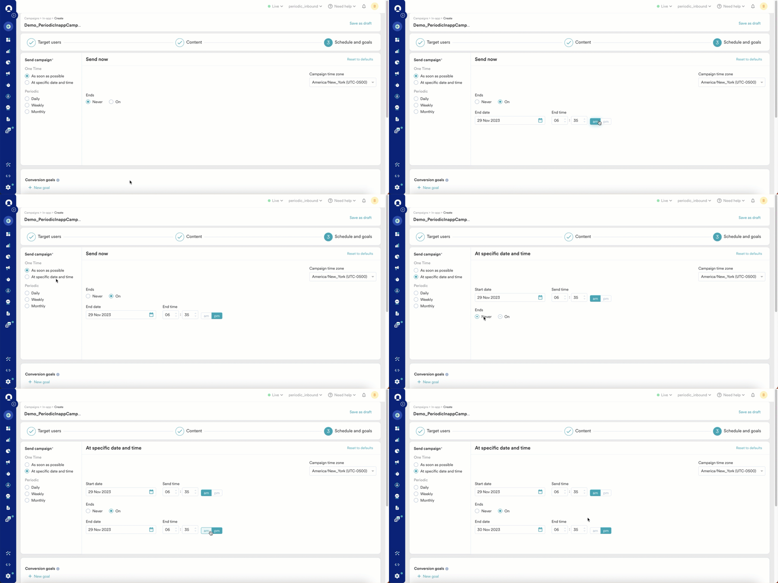
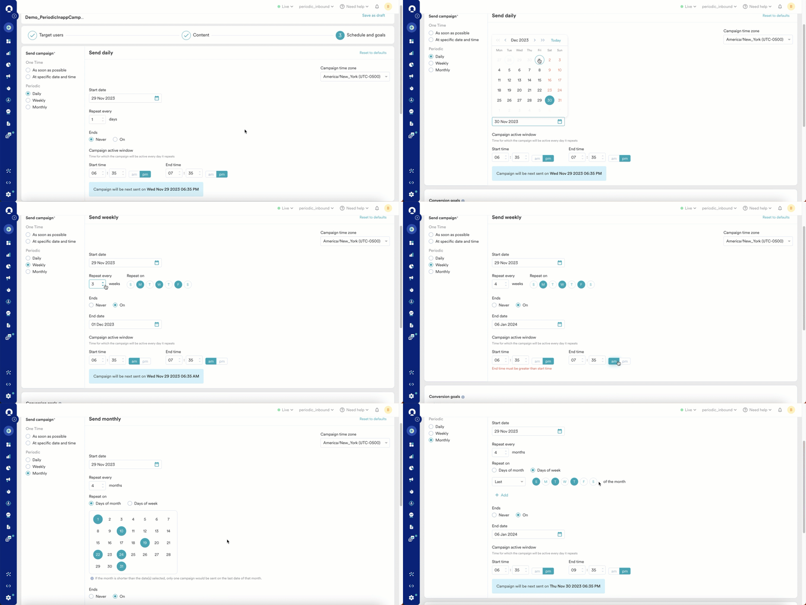
Conversion Goals
You can add conversion goals to track business metrics for your campaigns, with a maximum of five goals. Choose any app event as a conversion goal activity. The first goal is treated as a primary goal. For example, if you want to track the number of customers who purchased an iPhone after your campaign was sent (Event: Purchase event, Product: iPhone), your conversion goal setup might resemble the following image: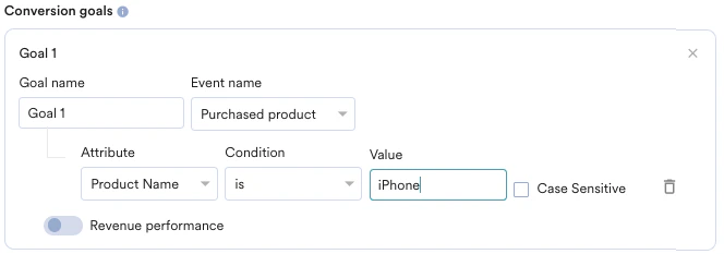
- How many users viewed the product page?
- How many added that product to the cart?
- How many made a successful order?
Tracking Revenue Performance (Optional)
Tracking Revenue Performance (Optional)
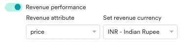
With MoEngage, you can track the revenue generated by your campaigns. For example, track the revenue generated by your product after sending a communication. To track revenue performance, enable the Revenue performance toggle for the conversion goal for which you want to track the revenue. In the example here, to track revenue for orderSuccessful events, enable the Revenue performance toggle.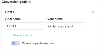

Campaign Priority
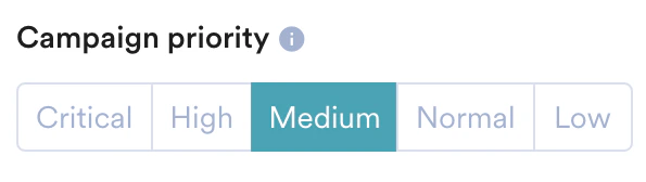
Set a priority for your In-App campaign as Critical, High, Medium, Normal, or Low. Campaigns that use the On push click trigger have an additional Critical - Functional priority. Critical - Functional ranks above all other priorities, including Critical, so the linked In-App message displays over all other campaigns. For On push click campaigns, the priority is set to Critical - Functional automatically and cannot be changed.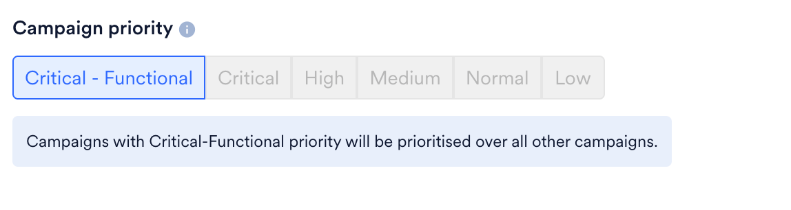
Delivery Controls
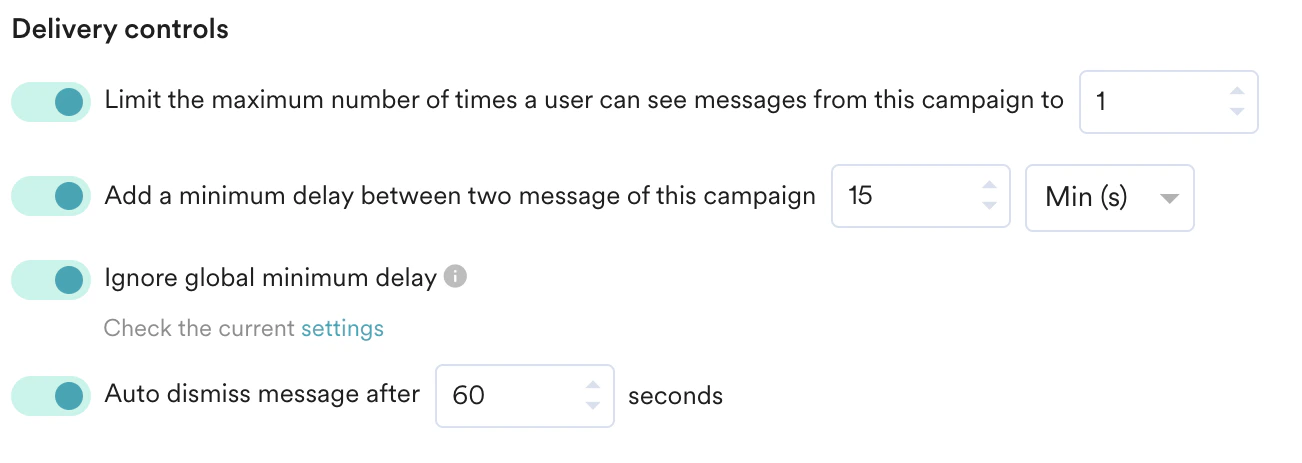
You can select the following options for your In-App Campaign:- Limit the maximum number of times a user can see messages from this campaign to: Control campaign frequency by entering how many times to display the message. Note: Frequency capping works at the device level, not the user level. This means if your user logs on to two devices at once, they receive the campaign on both devices even if the frequency setting is set to 1.
- Add a minimum delay between two messages of this campaign: Add a minimum delay between two messages to control the frequency and timing of displaying In-App messages to the user. This setting is disabled for Nudge Templates.
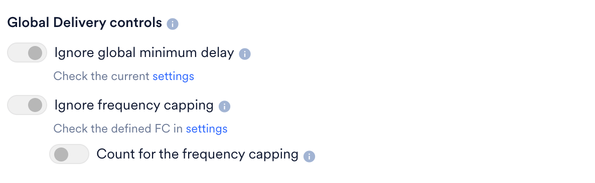
- Ignore frequency capping: Enable this toggle to ignore the frequency capping limit for this In-App campaign. For more information, refer to Frequency Capping. Note: Support for frequency capping is available from In-App Android SDK version 9.8.0 and In-App iOS SDK version 7.04.0.
- Count for frequency capping: Enable this toggle if you want the In-App message to be included in the overall frequency capping, allowing you to monitor the total number of messages delivered to the user.

- Ignore global minimum delay: Enable or disable global minimum delay settings for this particular campaign.
- Auto Dismiss message after: This option dismisses the In-App message after a specified duration (in seconds). After the specified time, the In-App message is dismissed even if the user does not perform any action on it.
For On push click campaigns, MoEngage configures the delivery controls automatically so the linked In-App message always displays when the user clicks the push. The maximum number of times to show, the minimum delay between messages, Ignore frequency capping, Ignore global minimum delay, and Count for the frequency capping are disabled and cannot be changed. Only Auto dismiss message after remains configurable.
Delay Between Two Campaigns
Delay Between Two Campaigns
If you have multiple In-App campaigns, you can stagger them by setting a minimum delay between messages from different campaigns. Go to Settings > Channels > Delivery controls.Note: This minimum delay applies to messages from different campaigns and the same campaign.Here you can set the minimum delay (in minutes) between two In-App messages from different campaigns. With this setting, if your user sees a message from Campaign 1 at time T and another message is sent before T+15, it does not display.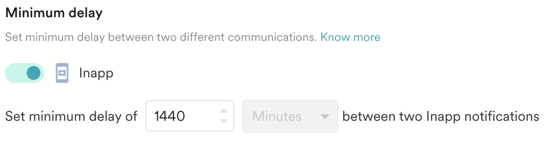
In-App campaigns support the Campaign Approval Workflow (CAF). If CAF is enabled, the campaign must be reviewed and approved for publishing. For more information, refer to CAF. To enable CAF, contact your Customer Success Manager.